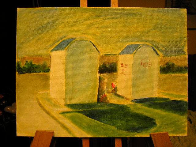
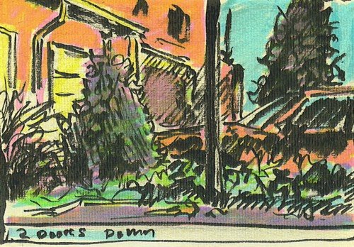
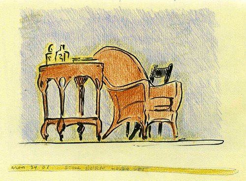




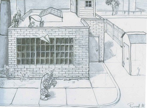
 My first though was to place him in one a "Save TheChildren" donation box. You can see these in Scarbourough, ususally in pairs or threes. Cute idea, but then the interior isn't going to work unless I distort the space - or ignor it.
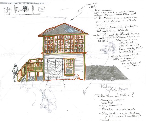 pain to draw over and over again. It will also dictate that their home is some place near train tracks, because for the story I don't want to part from reality that much. There fore the tiny factory building works best for me. The next step is to design and model the interior, then map the neighbourhood.
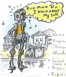
The back-story so far...
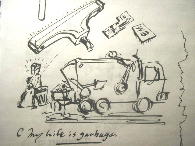
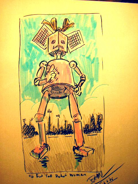
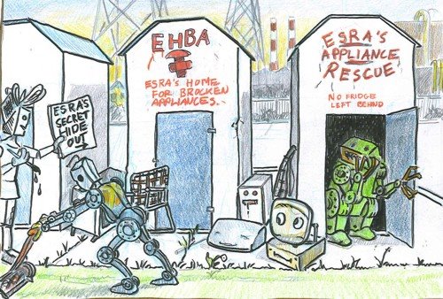
The main character is ESR-A (Engineer Sanitary Robotic -Type A) a robot who started out as a military Artificial Intelligence experiment gone wrong, and was eventually sold off to a civic sanitation department as a robotic garbage man. He develops emotional attachments to discarded appliances and tries to rescue them. This doesn't go down well with the sanitation department and they want to scrap him, so he runs away and becomes a renegade robotic garbage man/Don Quixote's/My Favorite Martian type. He is not well made, his parts don't fit well and he's not running on all transistors. he has some rather remarkable capabilities from his "Army Days" but they are iffy at best and sort of underwhelming.
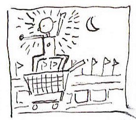
The foil is a robotic garbage can named Poubelle Libre, who is a female self-loading garbage can/Sancho Panza on wheels. I'm thinking the techs on her development team might have thought they were designing a self-loathing garbage can. She has run off and become a renegade also. She hooks up with the hero and helps him rescue appliances.
The antagonist is GLRR-BIN. a robot with a similar history to our hero's, but is even less well designed and less clever. He is very ungainly, ugly as all getout. He was designed as a paper shredding Bot to find and destroy sensitive documents and other refuse, but he is slow and dim. His one remarkable bright spot is unintended and unfortunate. He chews up documents and excretes lists. He was at some point tasked to to capture and destroy the hero, but was so inept that he was to be scrapped also. He joins the hero and Poubelle, but is always on the verge of turning them in. He is too much of a conformist to truly rebel. GLRR-BIN is basically a walking box. He looks and is powerful, but the power is useless. His massive arms are not capable of lateral movements and are only for lifting paper and small objects to his huge rectangular, paper-shredding mouth and his powerful legs are short stubby little things with no articulation. He is not capable of speed or movement on irregular surfaces. Stairs will be a challenge.
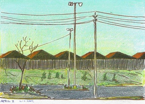
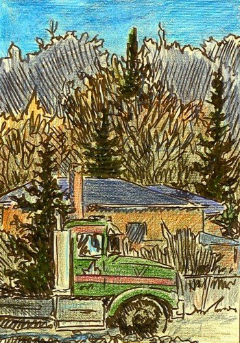
They live in a "mixed use" nieghbourhood on a residential street. The view out the back of their home is of industrial buildiings and a distant city scape. Their house is the one under the high tension power lines. It is a small factory building or somethng like a railway switching tower. They live there in hiding, although only nominally so. ESR-A occasionally has to disguise himself, and they have to keep an eye out for Sanitation Department inspectors. The yard is littered with broken appliances. most nieghbours are blasé but there is at least one Mrs Kravitz (or Mr.). they need to deal with from time to time.
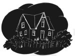
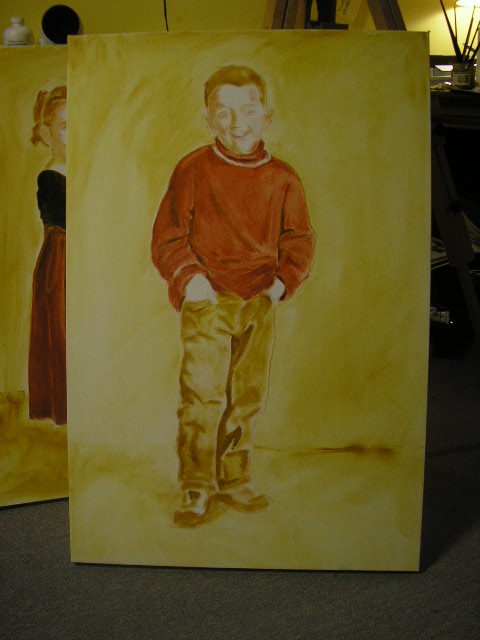
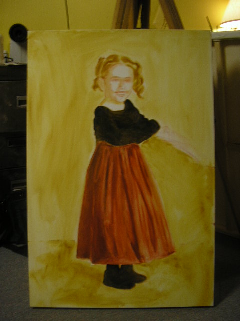
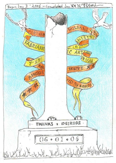

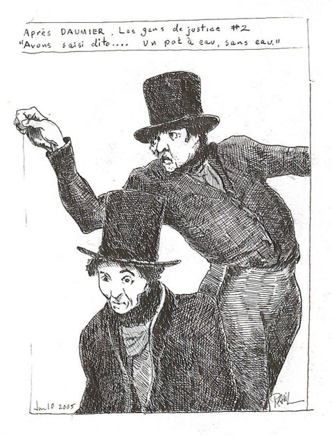



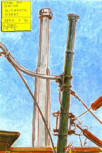
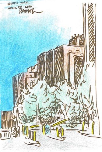
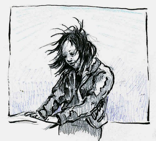
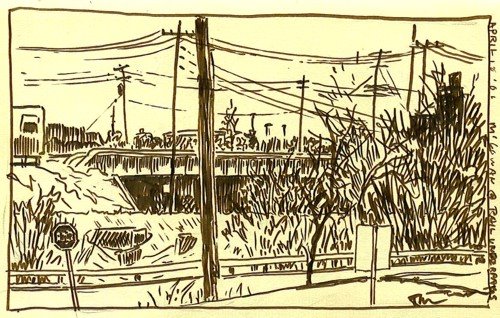
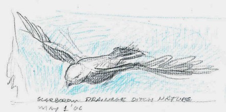
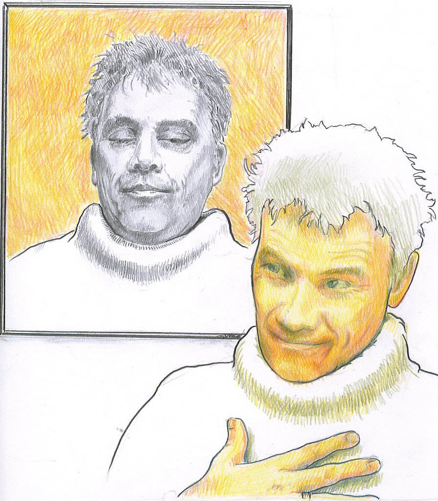 Pencil and coloured pencil.
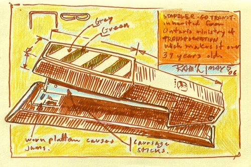
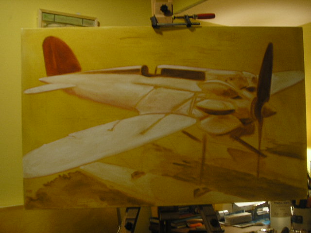
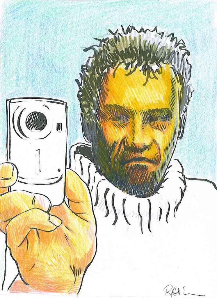 Pencil, brush pen, and colured pencils.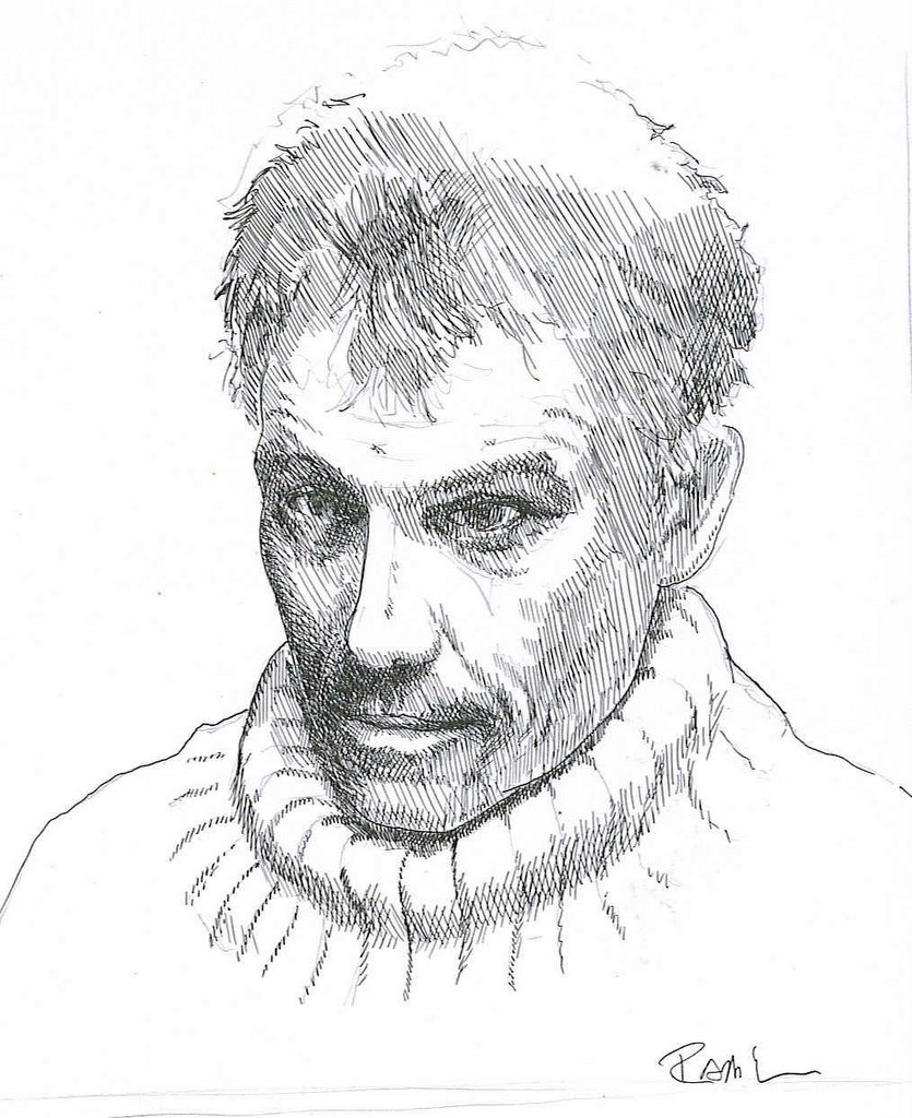
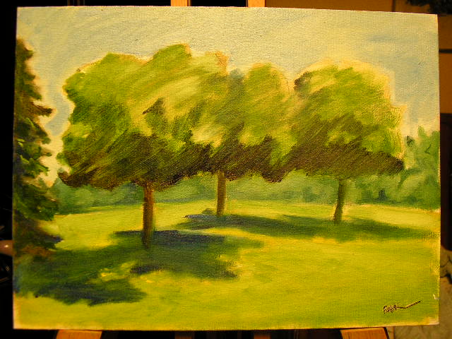
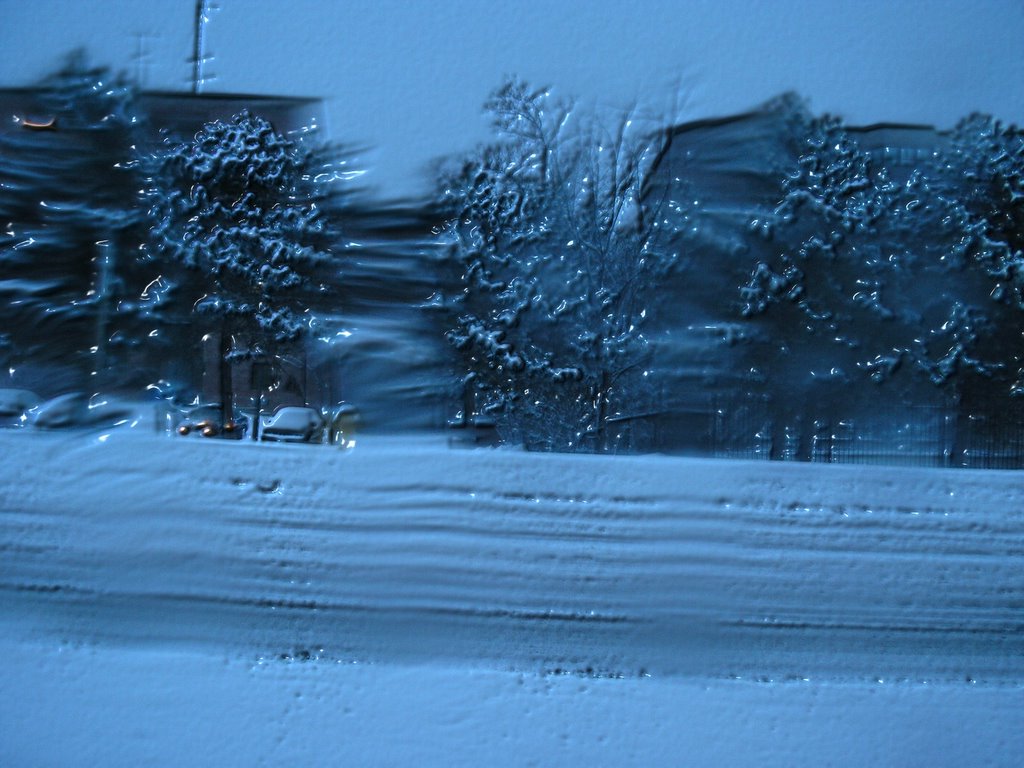
 Much to my delight and very unexpectedly, I've been invited to participate in a group exhibition of art, opening in Winnipeg and touring to Kitchener and Montreal. What seemed to get the attention of the organizer, James Culleton was my "fuzzy" photographs, fitting with the theme, of "blurred or double vision" as they do, of course. So I've thought about how my work fits into that theme. I'm trying to decide what pieces it include.
I don't often like to do things without a reason. Or a sense, at least, that there is a reason. The reasons may often arbitrary, and clouded in uncertainty to be sure. As we navigate through life, both physically and metaphorically, we try to attach to some sort of firm ground to provide a sense of certainty about who, where, why, when and what we are - In relation to everything else. Sort of a "You are here" sticker on a mall map. In this context, I see blurred vision as being synonymous with uncertainty.
 I'm a graphic designer. My area of expertise is wayfinding signage. I'm employed by a transit agency and a large part of my job recently has been the background work on redesigning our signage standards. When one is designing such a thing, it is important that it look good, but the first item of concern is function. You don't just change something because you feel like it. You need a reason, and the reason needs to be the right one. Who does it serve and how can we make it functionally better and not cost too much...
An actuality is that not only is the demographic mix of passengers getting a little older but most of our passengers catch their trains before sun up and after dark for most of the year and in all sorts of weather. After taking the train once, you pretty much know your way and never need to look at directional signs again. It's not rocket science, but with growth and the turnover rate, as people change jobs, find other ways to get to work, etc. There are hundreds of people every day who are new to the system. People are rushed, distracted and not fully awake while trying to find their way to the right train, figure out how to by a ticket, when the next rain arrives and so on. A sign is virtually never needed when viewing conditions are ideal, so we needed to find a typeface that could be demonstrated to be more legible than all others in all viewing conditions. I did this by selecting a few that were design to meet those criteria in the first place.
 They were; Tiresias, designed by a team of scientists at the RNIB ((British equivalent of our CNIB.)) APHONT. Designed by a similar team at The American Printing House for the Blind. ClearviewHWY, designed by a graphics firm in co-operation with Transportation engineers and thoroughly tested in all weather conditions using cars moving at highway speeds on a full scale test track. ((Subjects were tested for the distance they were from a sign before they could read it and how long it took to read.)) And finally, Transit Font FF, designed by Eric Spiekermann for MetaDesign in their German office , to meet requirements for improved signage after a fire at Düsseldorf International Airport that killed quite a few people. It is now used by quite a few German Public Transit Agencies - Hence the name, I guess. The typeface we have been using is Helvetica.)
Sort of a follow the dotted line idea, but you rely a little on their logic and a little on your ability to communicate visually, but in the mean time, there is a lot of noise to interfere with both. (the dots maybe very far apart and not easy to see at first) Imagine trying to find a washroom at a mall. You start with some basic reasoning:
 So, there are certain things you know at the outset. A set of logical conclusions you can make before you begin looking, even though the design and layout will be different in every mall. There is still a degree of uncertainty until you can picture where you are in relation to where you need to be. Once you know, you can relax. With my art, I want to take that certainty away. It's about looking for things. Not finding them.What I found with the type face tests was that (mostly with Helvetica), certain letter shapes would close when blurred: The letters s & a and e could be come indistinguishable. Other letters or combinations of letters are the same shape, as in the word 'Ill' for example. We read by word shapes as much as by letter shapes though, so even if you can not identify any letters in a word you can make an educated guess about what the word is, and when the word is in context, you can be 100% certain. The process is slowed down though, which is why it is an issue in wayfinding signs. On the other hand, it is interesting how much information we can dispense with and still function.