So, New York's taxis are getting a new livery
The new design seems a bit lack-luster to me, so in the spirit of - "And You Think You Can Do Better?" I played around with some ideas: I'm all about continuity here. Or at least in designs one and two. Taxis have been a ubiquitous part of the New York City scape literally for centuries. They have always had an in your face look that shouldn't be lost, and in keeping it helps to refer to that history.
 The typeface used for the word "TAXI" is Square Slabserif 711, by Geoge Trump (1990), sliced and diced into a stencil, to be reminiscent of the home made look of the painted-with-a-can-of-black-spray-paint-and-a-stencil livery of the recent past. I chose it because it is robust and thoroughly no-nonsense. The checkers are the new NYC logo. In keeping with the Wolff Olins flexible banding philosophy I've reduced it to a colour, and made black squares out of it. It has been pointed out (repeatedly) that since they are New York City taxis, in New York City, there is no need to reiterated that fact with a big bold city logo. Save that for smaller cities that aren't so sure of themselves. Therefore, In my designs, the new logo's presence on the cab is just another part of their long history.
 In design number 3, I've dropped the city logo altogether, and just used with the word TAXI scaled up to more than fill the available space. It's a yellow car with a light on the roof. Of course it's a taxi. You don't need to be able to read something on the car to tell you that. But just in case you do need to distinguish it from a non-cab Crown Vic that happens to be yellow, how about a big bold design? The vehicle fleet numbers and the fare information are set in James Montalbano's ClearviewHwy 5B, because it's a good functional typeface for the purpose. The fleet numbers are for operational purposes, and should therefore be plainly visible and highly legible to help the people who need to reference that number, which may be in a dimly lit garage among dozens of identical cars, or at 5:00 in the morning, before a second cup of coffee. The fare information obviously should be easy to read for the convenience of passengers and efficiency of service. And, I like it.
 It was with great interest that I came across this site a little while ago. The faster you go, the sharper this amazing typeface looks:
press release
Brussels, 25 October 1999
In 1994, the members of European Parliament urged the creation of a new comprehensive road typeface system, the development of a ‘general high recognition and perception font’, and recommended adoption of uniform design practices. Now, after five years of extensive research, the European Committee for Uniformity of Type Design and Type Safety completed the research and presented legible-for-all-purposes-suitable-typeface. The typeface, named Euroface, was developed and studied through extensive design exercises, laboratory investigation and road tests. The result is convincing: Euroface is 42% more legible than Helvetica at the speed higher than 80 km/h and at 120 km/h legibility reaches a value of 5 ISRU*. The Committee’s recommendation were accepted and the adoption of the system in the EC countries should be completed by 2005. A Manual on Uniform Traffic Control Devices and Type Safety was published in 1999, thoroughly presenting the projects implication, possibilities and practical applications.
*International Standard Recognition Unit"
Project’s description
(excerpt from The Manual on Uniform Traffic Control Devices and Type Safety)
Introduction
In the early days of traffic control device systems, only broad specifications were enumerated by conventions or government bodies. Local jurisdiction were left to their own devices insofar as basic type design was concerned. With the passage of time and increased sophistication, all systems have become much specific about applications of type in public and many inconsistencies occurred. What is clear at the present time is, that there is the need for uniform design review procedures. To ensure the road safety for the next century, the European Committee for Uniformity of Type Design and Type Safety (ECforTS) organized an international design contest in order to find the-one-and-only-for-all-purposes-suitable-ultimately-legible typeface."
Hmm. That a project like this would be mysteriously shelved seems some how not so odd. The letters from such luminaries in the world of typography as, David Berlow, Dr. Rüdiger Metzker, Prof. Dr. Ernst Krefeld Hansen, Gerhard Unger, Gert Dumbar
are most illuminating. (At least 3 of whom are actual people.)
Russell, Tiresias
The Art House Co op in Atlanta Georgia sent 500 little Moleskin sketchbooks out to artists around the world, and asked them to fill them with what scares them. The show opens October 27.
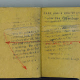 This one is mine

 I'm all about continuity here. Or at least in designs one and two. Taxis have been a ubiquitous part of the New York City scape literally for centuries. They have always had an in your face look that shouldn't be lost, and in keeping it helps to refer to that history.
 In design number 3, I've dropped the city logo altogether, and just used with the word TAXI scaled up to more than fill the available space. It's a yellow car with a light on the roof. Of course it's a taxi. You don't need to be able to read something on the car to tell you that. But just in case you do need to distinguish it from a non-cab Crown Vic that happens to be yellow, how about a big bold design?