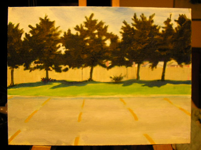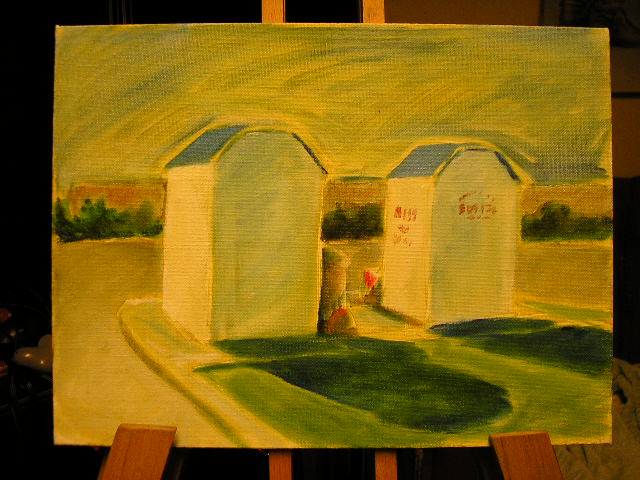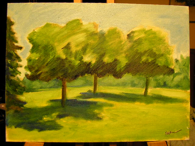
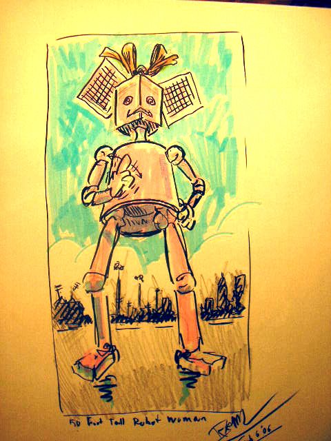
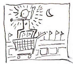
The 50 foot tall Robot Lady

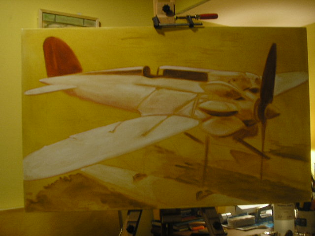
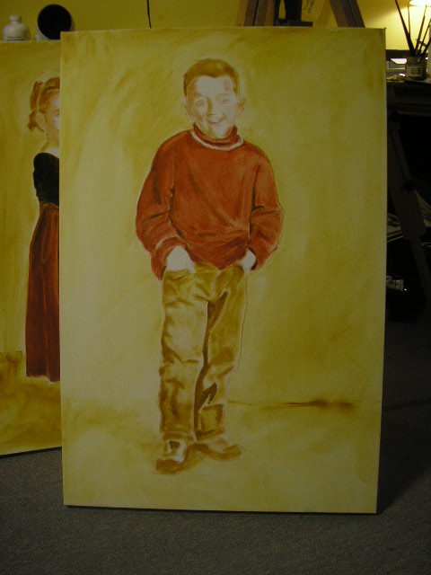
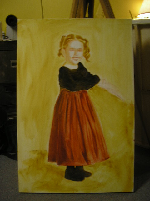
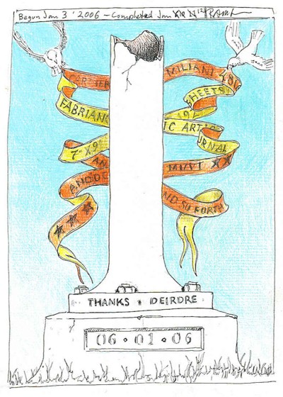




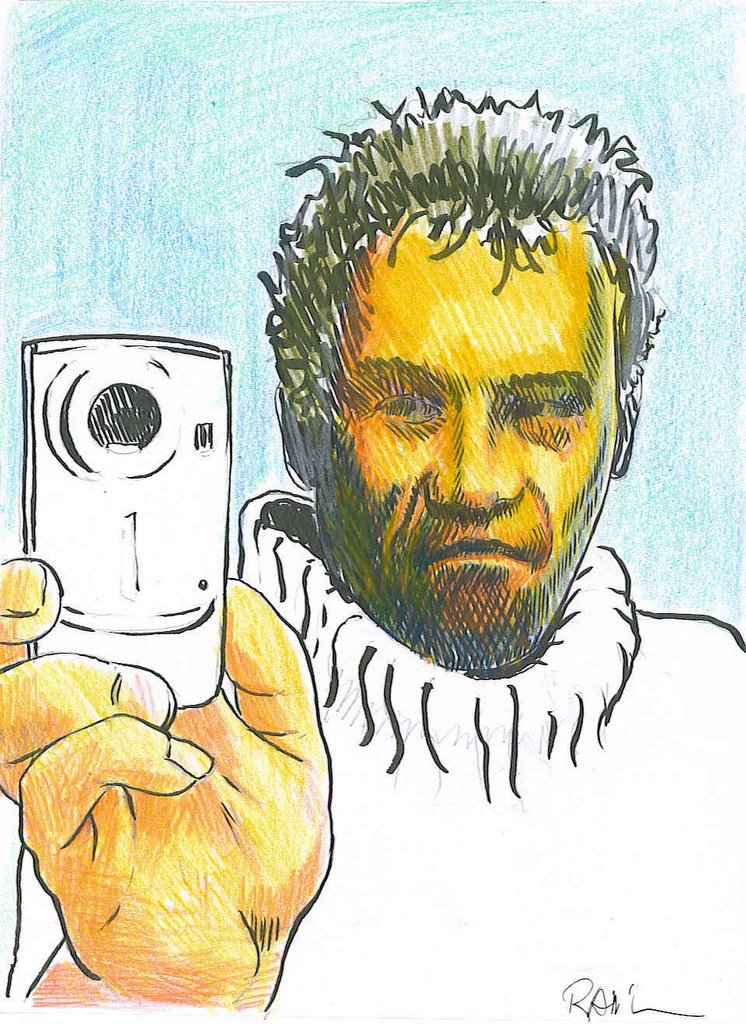
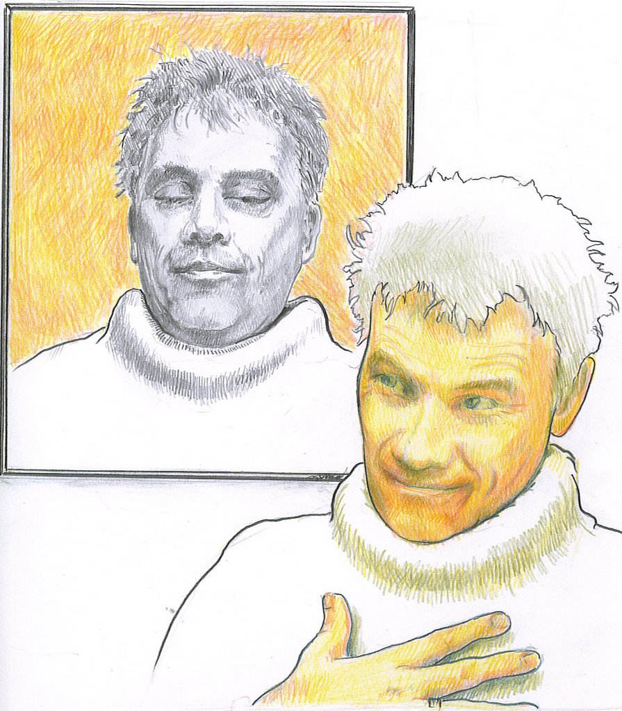 Pencil and coloured pencil.
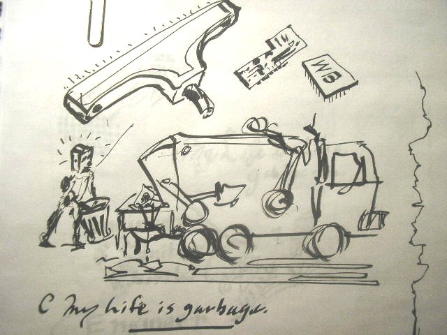
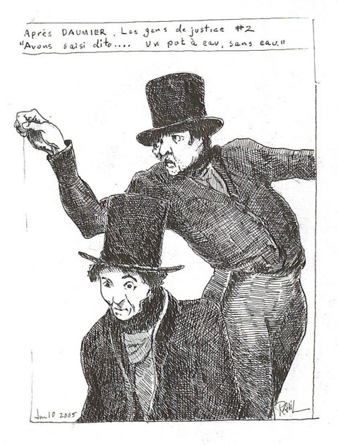
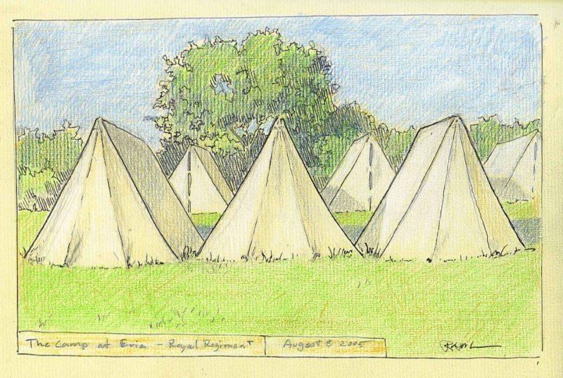
 Pencil, brush pen, and colured pencils.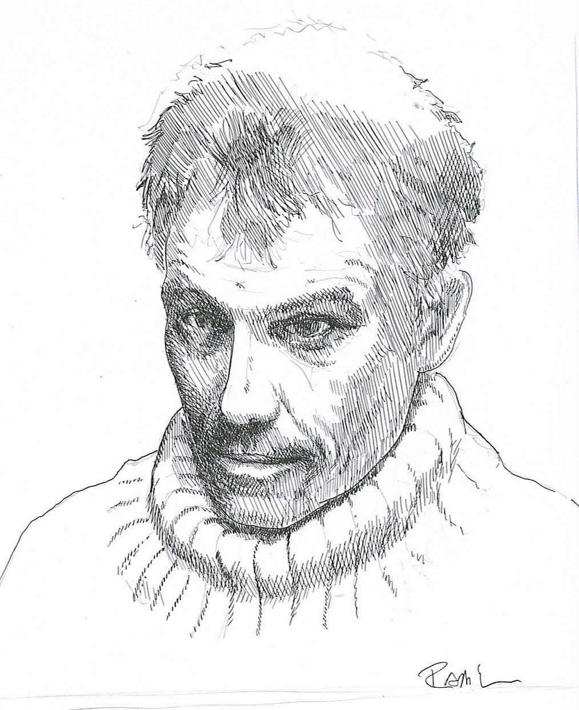
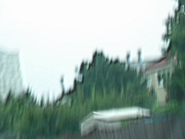
 Much to my delight and very unexpectedly, I've been invited to participate in a group exhibition of art, opening in Winnipeg and touring to Kitchener and Montreal. What seemed to get the attention of the organizer, James Culleton was my "fuzzy" photographs, fitting with the theme, of "blurred or double vision" as they do, of course. So I've thought about how my work fits into that theme. I'm trying to decide what pieces it include.
I don't often like to do things without a reason. Or a sense, at least, that there is a reason. The reasons may often arbitrary, and clouded in uncertainty to be sure. As we navigate through life, both physically and metaphorically, we try to attach to some sort of firm ground to provide a sense of certainty about who, where, why, when and what we are - In relation to everything else. Sort of a "You are here" sticker on a mall map. In this context, I see blurred vision as being synonymous with uncertainty.
 I'm a graphic designer. My area of expertise is wayfinding signage. I'm employed by a transit agency and a large part of my job recently has been the background work on redesigning our signage standards. When one is designing such a thing, it is important that it look good, but the first item of concern is function. You don't just change something because you feel like it. You need a reason, and the reason needs to be the right one. Who does it serve and how can we make it functionally better and not cost too much...
An actuality is that not only is the demographic mix of passengers getting a little older but most of our passengers catch their trains before sun up and after dark for most of the year and in all sorts of weather. After taking the train once, you pretty much know your way and never need to look at directional signs again. It's not rocket science, but with growth and the turnover rate, as people change jobs, find other ways to get to work, etc. There are hundreds of people every day who are new to the system. People are rushed, distracted and not fully awake while trying to find their way to the right train, figure out how to by a ticket, when the next rain arrives and so on. A sign is virtually never needed when viewing conditions are ideal, so we needed to find a typeface that could be demonstrated to be more legible than all others in all viewing conditions. I did this by selecting a few that were design to meet those criteria in the first place.
 They were; Tiresias, designed by a team of scientists at the RNIB ((British equivalent of our CNIB.)) APHONT. Designed by a similar team at The American Printing House for the Blind. ClearviewHWY, designed by a graphics firm in co-operation with Transportation engineers and thoroughly tested in all weather conditions using cars moving at highway speeds on a full scale test track. ((Subjects were tested for the distance they were from a sign before they could read it and how long it took to read.)) And finally, Transit Font FF, designed by Eric Spiekermann for MetaDesign in their German office , to meet requirements for improved signage after a fire at Düsseldorf International Airport that killed quite a few people. It is now used by quite a few German Public Transit Agencies - Hence the name, I guess. The typeface we have been using is Helvetica.)
Sort of a follow the dotted line idea, but you rely a little on their logic and a little on your ability to communicate visually, but in the mean time, there is a lot of noise to interfere with both. (the dots maybe very far apart and not easy to see at first) Imagine trying to find a washroom at a mall. You start with some basic reasoning:
 So, there are certain things you know at the outset. A set of logical conclusions you can make before you begin looking, even though the design and layout will be different in every mall. There is still a degree of uncertainty until you can picture where you are in relation to where you need to be. Once you know, you can relax. With my art, I want to take that certainty away. It's about looking for things. Not finding them.What I found with the type face tests was that (mostly with Helvetica), certain letter shapes would close when blurred: The letters s & a and e could be come indistinguishable. Other letters or combinations of letters are the same shape, as in the word 'Ill' for example. We read by word shapes as much as by letter shapes though, so even if you can not identify any letters in a word you can make an educated guess about what the word is, and when the word is in context, you can be 100% certain. The process is slowed down though, which is why it is an issue in wayfinding signs. On the other hand, it is interesting how much information we can dispense with and still function.

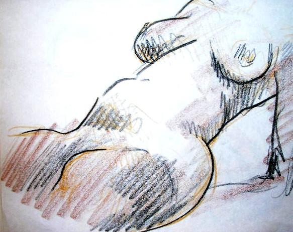 WE have been attending an informal figure drawing class at the Gladstone Hotel, in the "Art Bar" (so called because of the weekly figure drawing classes, ongoing since 1968). We buy ourselves a beer, then sit in the company of some really quite accomplished artists and draw.

 In October, 2003, my wife bought us each a 6 1/4" X 8 5/16" sketch book. 192 pages of a very nice, slightly toothy Fabriano drawing paper. Cartiere Milani Fabriano was founded in 1282, in Fabriano, Italy and is the oldest paper mill in Europe. They are credited with inventing the process of embedding watermarks in paper and gelatin sizing to make paper more receptive to ink and paint and more stable as a medium for documents. I could mention at this point that my wife and I share a delight in the texture, weight and feel of a really good paper.
 There were fault lines in the electromagnetic field.
 You could map them out following a sequence of Lorenz graph plots, spanning vast periods of time. They would show up in weather patterns and earthquakes. They would show up in crime statistics, unspeakable atrocities, wars, UFO and Virgin Marry sightings. Pins on a map of natural and man-made disasters. Boulders under a fast moving stream revealed only by turbulent disturbances in the current.
Finding that pattern was next to impossible. Once found though, tracing a line forward would inevitably take the observer to a sweet spot - A precise set of coordinates where, as with finding the the stone in the stream, if you caefully trace a line back up-stream, you may find the precise place and time where you can drop a leaf and know, from any distancer, it will go neither to the left of a sand bar nor the right, but run aground like an unlucky sailor. The art is in knowing where to look, and when. The science is in narrowing the range of probabilities and tracing the line back as far as possible.
These Spots are active.
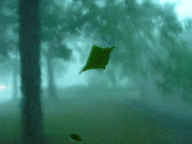
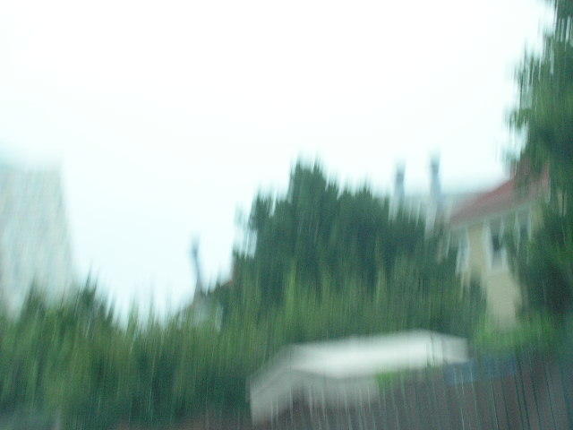 ... Which means, what? It was a line from a story I wrote many years ago. Something sureal about it. I liked that. Still do. I no longer have the story. Just the line and a fuzzy recollection of a "B Street" and a plant with machinery inside that rattled windows in surounding run down, turn of the century industrial buildings, and the protagonist was always threatening to blast the listener. The fuzzy photograph is a sort of vague memory and not a partucularly valued one at that. At least not by most.