Tuesday, November 27, 2007

And then there is this crazymaking type thing

I have not been able to find any documented or demonstrable legitimacy behind Tiresias as a Signage typeface. The "scientific" claims said to support Tiresias Signfont are flimsy at best and not even relevant to a signage typeface. All the evidence that is referred to on-line is from testing of Tiresias Screenfont, which is intended exclusively for use in captioning on television screens. This is a unique application of type because of the low resolution. I can find no reference to any testing by RNIB of actual signs in any form. It appears that assumptions were made from testing of Screenfont and extrapolated to fit someone's idea of a typeface for signage.

A review of the backgrounds of the team members involved in the development this typeface reveals that no one with any substantial experience with signage or type design has worked on the font. (Design of signage is not listed on the Laker-Sharville web site as a one of their capabilities).
The research done by the [----] is already just about equal in scope to published results from what has been done by the RNIB and the Tiresias team, and it doesn't show Tiresias to be any kind of Magic Bullet for improved legibility compared to other comparable typefaces.

A careful reading of the documentation behind Tiresias leads me to conclude that Joe Clark is absolutely correct in his assessment of the typeface. His commentary is entirely about Tiresias Screenfont, however, as it would appear that the Tiresias team has done no more than make assumptions about what a signage typeface should look like, based on conclusions made about Screenfont. It is therefore as relevant as any other commentary available about Tiresias Signfont, either pro or con.

The following is my own summation of the development, support and validity of Tiresias Signfont from reading the relevant reports and documentation of this typeface:
  • The Tiresias project was conceived as a project to improve captioning on TV screens.
  • Making a signage font was an after-thought.
  • A 'professional' typeface designer was brought into the project late in the process - Essentially to clean up what had been already created and to convert the letter glyphs into font files. This actual typographic work on Tiresias was done by Chris Sharville.
  • Tiresias is evidently his first attempt at a typeface. There are no others credited to him on the market, and Tiresias is the only typeface listed in his portfolio.
  • Creating, or even editing an existing font, is a very complex task, and it is a lot to expect of a designer to master all of the subtleties required in a first attempt. A review of Mr. Sharville's on-line portfolio will reveal that he is a competent designer, but not exceptional.
  • The typeface (Screenfont) was tested on 35 visually impaired subjects and 48 hearing impaired subjects, (plus a small number of guides and sign language interpreters) using simulations of TV captions instead of actual captions.
  • As with the ---- tests to date, subjects who participated in Tiresias font trials did not represent an average demographic group.
  • Tiresias Screenfont was only tested against two other fonts; Times New Roman and Standard Alpha-mosaic. Times New Roman, with serifs and a lower x-height, will not reproduce very well as small text on a TV screen and Standard Alpha-mosaic is a dot matrix font (they used 7X5 dots and 9X10 dots). It would be difficult to find a sans-serif typeface that was not better than these two for captions on a television screen. That they would choose to compare these typefaces for any reason seems to indicate a remarkable ignorance of Typography.
  • All typefaces were set at 14 points. Point sizes are nominal and measure the the distance from the highest ascender to the lowest descended plus some empty space. Times New Roman has a lower x-height and is visibly smaller than Tiresias set at the same point size (by about 10%).
  • Tiresias Signfont was designed based on assumptions from the research on Tiresias Screenfont.
  • The report states in it's conclusions; "It is freely admitted that this "testing" is far from ideal and could even be described as anecdotal."
  • All references to scientific research in support of Tiresias Signfont point to material about Tiresias Screenfont and "Access Prohibited?", a British website about guidelines for barrier-free environments, which is as vague as similar North American documents, in that all it says about typefaces is that larger text is more legible.
  • There is absolutely nothing in the literature about the development of Tiresias that describes how the design and the geometry of character shapes and the metrics of letter spacing and kerning has been treated differently than in other typefaces that hasn't been axiomatic to the the world of type design for at least a century.
  • Tiresias is a bold single-font typeface with no light or medium weights and no italic. Having only one weight with no italic removes the option of ever using emphasis to call attention to important information while adhering to the graphic standards of a signage system. ( --- says that Signfont now has italics and a lighter weight, however, we should believe that when we see it. There is no mention of this on-line and they are not for sale anywhere.)
  • For a modern typeface intended for signage that's legible to persons with poor eyesight, it is odd and disappointing that there has been no consideration given to the effects of halation for back lit and retro-reflective signs or the 'dazzle' effect of white type on a black background.
  • Browsing through the specimen books of any major type foundry will turn up numerous typefaces that have all of the characteristics Tiresias infers are unique to their typeface in aiding legibility, with the exception that these other typefaces will have multiple weights and italics - and look better. If the initiators of Tiresias Screenfont project had known that, would they have bothered?
The features that make Tiresias legible are not new or complex. In fact, they are fairly commonplace: Make open shapes open, use large x-height, use open tracking (letter spacing) etc., etc. In the 550 year history of type design, I'm sure the list of people who have made the creation of legible typefaces a big part of their life's work, is a long one. It's just good business in the printing business.

One has to ask, how likely is it that a team of scientists with no knowledge of design or typography, and a novice type designer are going to come up with something that hasn't been thought of already in the last 550 years? In modern times, people have become more aware of legibility of signage and screen typefaces, however, the exact same principles apply, except, due to distances and low resolution, simpler shapes (sans serif) and increased tracking are helpful. The key factor is size and you don't need science to tell us that.


As noted elsewhere, I am not defending FF Transit specifically. It was chosen out of a small, predetermined field and it turned out to be a significant improvement over Helvetica. There are other a typefaces available that meet all the criteria for signage for public transit (legibility, economical use of lateral space, versatility, etc.) FF Info would be a good alternative choice as would Arrival, by Keith Tam or M.O.L. , by Gerard Unger, all specifically designed for wayfinding signage in a public transit environment. Our intention from the start, has been to make our signs more legible and therefore more accessible. I think the differences in legibility between one good quality font and the next will be very small and not worth the effort and expense of measuring. It all comes down to some simple geometry and the metrics of letter spacing, x-heights and etc. that make up the basic information that reaches the eye.

Saturday, October 20, 2007

NYC Cab Graphics

So, New York's taxis are getting a new livery

The new design seems a bit lack-luster to me, so in the spirit of - "And You Think You Can Do Better?" I played around with some ideas:

I'm all about continuity here. Or at least in designs one and two. Taxis have been a ubiquitous part of the New York City scape literally for centuries. They have always had an in your face look that shouldn't be lost, and in keeping it helps to refer to that history.

The typeface used for the word "TAXI" is Square Slabserif 711, by Geoge Trump (1990), sliced and diced into a stencil, to be reminiscent of the home made look of the painted-with-a-can-of-black-spray-paint-and-a-stencil livery of the recent past. I chose it because it is robust and thoroughly no-nonsense.

The checkers are the new NYC logo. In keeping with the Wolff Olins flexible banding philosophy I've reduced it to a colour, and made black squares out of it. It has been pointed out (repeatedly) that since they are New York City taxis, in New York City, there is no need to reiterated that fact with a big bold city logo. Save that for smaller cities that aren't so sure of themselves. Therefore, In my designs, the new logo's presence on the cab is just another part of their long history.

In design number 3, I've dropped the city logo altogether, and just used with the word TAXI scaled up to more than fill the available space. It's a yellow car with a light on the roof. Of course it's a taxi. You don't need to be able to read something on the car to tell you that. But just in case you do need to distinguish it from a non-cab Crown Vic that happens to be yellow, how about a big bold design?

The vehicle fleet numbers and the fare information are set in James Montalbano's ClearviewHwy 5B, because it's a good functional typeface for the purpose. The fleet numbers are for operational purposes, and should therefore be plainly visible and highly legible to help the people who need to reference that number, which may be in a dimly lit garage among dozens of identical cars, or at 5:00 in the morning, before a second cup of coffee. The fare information obviously should be easy to read for the convenience of passengers and efficiency of service. And, I like it.

Friday, October 12, 2007

on the subject of Legibility: Euroface

 Perception of Euroface's characters at different velocity. (image from site quoted bellow)It was with great interest that I came across this site a little while ago.

The faster you go, the sharper this amazing typeface looks:
press release
Brussels, 25 October 1999

In 1994, the members of European Parliament urged the creation of a new comprehensive road typeface system, the development of a ‘general high recognition and perception font’, and recommended adoption of uniform design practices. Now, after five years of extensive research, the European Committee for Uniformity of Type Design and Type Safety completed the research and presented legible-for-all-purposes-suitable-typeface. The typeface, named Euroface, was developed and studied through extensive design exercises, laboratory investigation and road tests. The result is convincing: Euroface is 42% more legible than Helvetica at the speed higher than 80 km/h and at 120 km/h legibility reaches a value of 5 ISRU*. The Committee’s recommendation were accepted and the adoption of the system in the EC countries should be completed by 2005. A Manual on Uniform Traffic Control Devices and Type Safety was published in 1999, thoroughly presenting the projects implication, possibilities and practical applications.

*International Standard Recognition Unit"

Project’s description
(excerpt from The Manual on Uniform Traffic Control Devices and Type Safety)

Introduction
In the early days of traffic control device systems, only broad specifications were enumerated by conventions or government bodies. Local jurisdiction were left to their own devices insofar as basic type design was concerned. With the passage of time and increased sophistication, all systems have become much specific about applications of type in public and many inconsistencies occurred. What is clear at the present time is, that there is the need for uniform design review procedures. To ensure the road safety for the next century, the European Committee for Uniformity of Type Design and Type Safety (ECforTS) organized an international design contest in order to find the-one-and-only-for-all-purposes-suitable-ultimately-legible typeface."


Hmm. That a project like this would be mysteriously shelved seems some how not so odd. The letters from such luminaries in the world of typography as, David Berlow, Dr. Rüdiger Metzker, Prof. Dr. Ernst Krefeld Hansen, Gerhard Unger, Gert Dumbar
are most illuminating. (At least 3 of whom are actual people.)

Russell, Tiresias

Tuesday, October 09, 2007

The Sketchbook Project.

The Art House Co op in Atlanta Georgia sent 500 little Moleskin sketchbooks out to artists around the world, and asked them to fill them with what scares them. The show opens October 27.
This one is mine


Wednesday, September 19, 2007

D,R,I, and P

I spent the whole evening making tiny adjustments to templates. The I and P are not done yet. The R looks taller than the D. I think I like the second version with the shorter I.

Tuesday, September 18, 2007

R

Well, more on typography.


First, I have begun a more serious effort at designing a typeface of my own: D is for Daydins. The serifs are two intersecting radii, the vertical stems bulge slightly. This looks nice, put simply. Sort of 'hand-made'. It lends a graceful and at ease manner, and, what the heck I'd rather make a beautiful character set than an ugly one, but I also want to see how this works in a paragraph. I anticipate some problems with rendering at smaller sizes, though so far, for the few characters I've completed, they seem to work just fine right down to 7 points. I'm designing this in Corel, which to my surprise can create type 1 font files. I have no idea how I'll be able to get in and work on the kerning tables. There doesn't seem to be a way to do that in Corel. I'll have to get myself some proper type design software.


--------------------------------------------------------------

Thursday, June 14, 2007

Time to think about setting up our studio

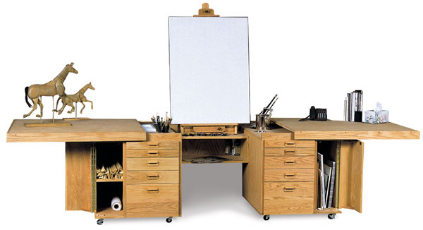
A couple of weeks ago we stayed near Dick Blick's Art Supplies in New York City's Noho area. Best vacation in a while. Today, I was cruising Blick's site, thinking about the hand-ground oil paints I'd seen there (and lust after to this day), when I decided to look at easels.

These ones
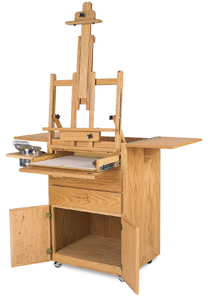
really grabbed my attention. I will be building my own "his and her's"versions this summer. Look for photos by fall.


The second one is do-able.

(This is the one and only
time I have used an image that isn't my own on this site.)


Thursday, June 07, 2007

The Opening

Another painting from the show.
(Scarborough Pine trees with Berm)


Well... I can't claim the opening was any sort of a major social event. For all I know the only guests were Glen Downer, Lori Asaro and Vince Ng of Onland Navigation and Design, who graciously downed-tools and drove all the way downtown from Scarborough to see what Angela had got around to hanging. I hung around for a few moments after they left and then after a word or two with Angela, the curator I also left.

I was a little surprised by the relatively small space that ended up being 'appropriated' for the show, but, she hadn't been able to install the second bar for hanging pictures. Basically, I just took a bunch of paintings and the digital photo prints and told Angela to hang what she wanted and had room for. As it turned out the only painting hung was the double one on the Invite and the photos. AS the say, if you don't want to be disappointed, lower your expectations...My expectations were quite modest. Mostly, I'm pleased to have something new for my CV, and to keep
moving forward.

Friday, May 11, 2007

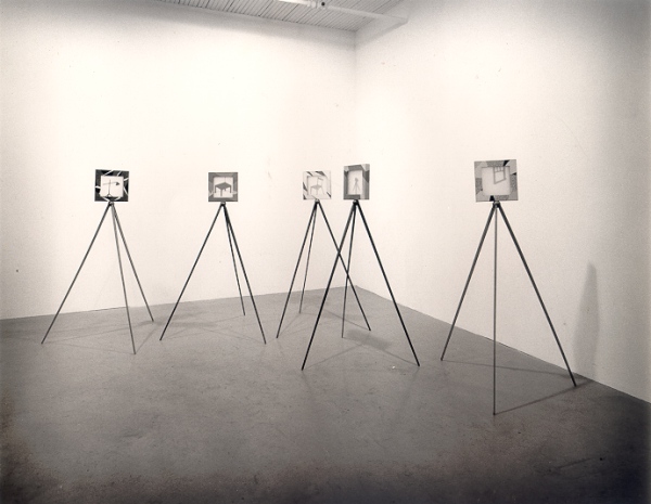
Small Rooms; Images from an old project.


... Really old.
(I did say I'd post some pictures of these pieces earlier)


These pieces are about 12" square and an inch and a half deep and they were originally meant to sit on tripods.

The images are cut from 1/8" plywood, and mounted between frosted Plexiglas. The designs on the frames are marquetry in 1950's vintage Formica.

Wednesday, April 18, 2007

Case For an Economical Typeface (space-wise, that is)


Wonderful & illuminating visual aid.


... WELL, sort of "to the wall"... I wrote the following diatribe
for the Eddy-fication of various persons and I hope it had a
little impact.


........... , regarding a probable preference for Tiresias as a typeface on signage, I'd like to interject some notes on why I recommended against it and in favour of FF Transit, . ....

Tiresias and APHont are indeed highly legible typefaces, however, the features that make them so also make them quite wide, due to open, generous counters, wide cross strokes and corresponding open letter spacing. In many circumstances, within the context of a service such as __ _______, available horizontal space is limited more often than vertical space. This means that we will frequently lose any advantages that Tiresias and APhont have to offer by being forced to reduce letter height to fit messages into limited spaces. In the (admittedly limited*) testing I conducted in-house, I found that we'd have to shrink Tiresias and APHont by a little over 15% to occupy the same horizontal space as Transit. With some long place names, limited spaces for sign installations - And the inclusion of a second language which tends occupy more space, this is a fact that can't be ignored.

While all legibility testing is subjective, it was clear to me that when this was taken into consideration, Transit was the most legible typeface I looked at. Also, (as of the last time I looked) Tiresias Signfont is available only in one weight with no italic. When I asked RNIB's John Gill if they were planning to add additional weights and italic variants to the mix he said he'd look into the cost. Shortly after that Sylvie Perera (Human Factors Scientist. RNIB Scientific Research Unit) emailed me to say, "We will be producing the italic and bold versions of Signfont for you as soon as possible." . [Oddly, she made it sound as if she was under the impression I'd placed an order - of course she didn't, but I still had to get her to clarify what she meant.] .... To date I have seen no evidence of italic or other variants When I was making my inquiries about APHont, Elaine Kitchel told me that a full suite was with the fontographer and was "due any day." and it is now available.

... Tiresias and APHont were designed by scientists - Dr. John Gill (RNIB) and Dr. Elaine Kitchel (American Printing House For The Blind) respectively. Or, rather teams lead by them. The characters they designed are individually well constructed so that they read well under poor visibility conditions, and they have been thoroughly tested with subjects who have varying degrees of low vision. But, in my opinion they do not "flow" as well as Transit. An experienced reader scans strings of text rather than individual letters and relies on word-shape recognition and context to aid reading, only pausing to distinguish individual letters when a word-shape is unfamiliar or something irregular interrupts eye movement.

The rhythm of Transit is more consistent than Tiresias or APHont. (rhythm being the balance between positive and negative space - which is important to legibility, as it aids in word shape recognition. There should not be uneven densities of colour to distract the movement of the eye.) I don't think those two fonts stand up as well to that test as Transit. I may appear to be a personal prejudice as a graphic designer speaking, but I do think that an experienced typographic designer will ultimately be better at designing readable typefaces.

Perhaps when comparing typefaces for relative legibility, there may be a tendency to also compare the credentials of the designers… Erik Spiekermann, the designer of Transit isn’t a scientist. He is, however, one of the world’s foremost authorities on the design of type. He is well enough qualified to design a highly legible typeface. He has designed many typefaces and many wayfinding systems including for public transit systems, airports etc. He was a co-founder of the first distributor of electronic type and founder of MetaDesign. He has authored several highly regarded books on design and typography - I believe his understanding of legibility is at the very least, equal to Dr. Gill and includes an understanding of how type works in a signage system. Transit was initially designed for Düsseldorf Airport and is now used on the signage of many German public transit systems. It is also the typeface of choice for some projects in Britain to improver cities’ signage systems. (Example; http://www.bristollegiblecity.info/)

We need to be mindful of economy of space with our signage, as I indicated above and I thin we can do this without sacrificing legibility. Condensing letters to achieve economy of space without sacrificing legibility has been a goal of type designers since the invention of movable type and long before then, among calligraphers, mindful of the cost of vellum. The condensation of letter shapes in typefaces such as Transit is differential, with the greatest amount being applied to letters such as f, r, s, t and E, F, H, L, S, T, where it is easy to simply make the letters narrower without affecting distinguishing feature points. Less compression is applied to letters with open counters c, h, m, n, etc. and even less to letters with closed counters (insides of a, d, e, o, O, Q, etc.).


This is not written to specifically defend the use of Transit as our signage typeface - though I think it serves very well – It is an attempt to defend the use of a typeface that uses space economically and has superior typographic characteristics. There are many typefaces that fit the criteria of economical use of space and superior legibility. These would include Arrival by Keith Chi-hang Tam of Vancouver and M.O.L., by Gerhard Unger for the Amsterdam Metro.

In conclusion, the inconclusive results of the current CNIB study may be accounted for in words attributed to Eric Gill, (
1882 to 1940, known for the classic typefaces, Gills Sans and Perpetua, & no relation to Dr. John Gill): “Legibility, in practice, amounts simply to what one is accustomed to”. Although a little flippant, every joke has a kernel of truth and the truth in this one has been confirmed by research and common sense: Familiar shapes are more legible than unfamiliar ones. Differences in performance between any group of purposely designed "legible fonts" can be vanishingly small and more dependant on what each individual observer is used to reading than on subtle variations in geometry. - Except where horizontal space is limited. Then, a more economical typeface is likely to be better


* In the course of collecting data for the typefaces I examined for the ----- Typeface Review, I contacted all of the vendors to see what additional supporting information I might be able to acquire, and in every case I was directed to the designers, who were all very helpful. I did discuss my method of testing typefaces using uniformly blurred images and a questionnaire with both Elaine Kitchel (American Printing House for the Blind) and Dr. John Gill. They were both very helpful and generous with their time, and both replied that while not a rigorous test by scientific standards the principle was sound enough to give a good evaluation of relative legibility for what I was trying t
o determine. Erik Speikermann’s comments were equally helpful, and since he has a stake in the sales of his typefaces, I’d like to point out he was unbiased. In addition to explaining a little of the history behind the development of Transit, he suggested several typefaces by other designers he felt might also work.


Sunday, April 15, 2007

The Miraculous Gift

God gave unto Adam a gift of a miraculous bottle that had neither an inside nor an outside, and the inside was on the same plane as the outside and the outside the same as the inside.

Adam asked of the Lord, What is this, my Lord? And the Lord said unto him, This is the Universe. Learn from it for here is the nature of creation. And Adam said unto the Lord, I can not use this thing. It will not hold water or wine. I can not fill it with berries and it will not stand up by it's self on the mantle.

After a time, Adam
and Eve considered the bottle and decided to break off the neck and close up the bottom.

God saw this and was not pleased.
What is this have you done with the miraculous bottle I gave unto you? You have defiled it. I gave to you a thing of real physical and metaphysical beauty, that you may study it and see and understand the elegant genius of my creation and you have reduced it to a household object for storing your sour unpalatable wine.

Adam said unto the Lord, Now that we have fixed it so that it will hold wine
and water and given it a base so that it will stand on the table, it is quite nice
.

The Lord said unto Adam, I'll tell you what... That tree over there - Very
attractive, don't you think? Especially in the spring with it's blossoms. and practical too for it's rich harvests of fruit. Do not eat of it's fruit.

Friday, April 13, 2007

An observation or two about a building


I posted the following here - In reply to an article about
Rem Koolhaas' design of the CCTV Headquarters in Beijing. (I should be more diligent checking for typos before hitting "post".) Actually, I quite like his other buildings, and in fairness the only images I've been able to see of this building don't show much in the way of context.


If don't appreciate some finer points of modern architecture, in consequence I may also lack appropr
iate reverence for it's 'A' list names. So... Enquiring minds do want to know: Is it a wonky salute to Stonehenge? A stylized Chinese character? Does the shadow of the V in the roof line trace a particular and meaningful line on the streets below in the light of the full moon on Chinese New Year?

Averaged over the life expectancy of a building, the amount of steel and glass that go into it's construction, I think, must be a fairly insignificant largely an irrelevant consideration beyond the financial contstraints of paying for the materials. No matter how efficient you are, if you build something that shouldn't be built, every ounce of materials is wasted.

Not that this building should not be built... After all, it's not just another glass-box office tower, but a glass-box office tower that has broken out of it's rectangular mould - and into a more oddly shaped one. The building is simply not attractive, and appears to be about style for the sake of style? Different to be different... Not much different from the empty visual calories of a frilly new Easter bonnet -- Except an advantage enjoyed by viewers of Easter bonnets is that no matter how lovely or gaudy it is, you only have to look at it for a day or two. In this way, I think Koolhaas' CCTV Headquarters is the opposite of good design. Particularly for a prominent public building. All images I've seen of it are from the same angle as that shown at the head of this article, where essentially, it looks like an angular donut. Rotate it 45 degrees to the right and, if the renderings are drawn correctly, and I have to assume they are, it is a radically backwards-slanted letter 'z'.

There is something very unsatisfactory about that, as with what you'd feel looking at half a bridge that ends abruptly part way across a river. Nice as a sculptural statement, perhaps but only if there is something that explains or resolves the implied instability. It poses a visual question about balance and purpose that goes unanswered.

Are the exterior walls not vertical simply because, given enough steel, some good engineering and buy-in from the client, you can build walls at any angle you like? I don't think that's a good enough reason to impose such a large and improbable looking building on the people of Beijing. Will they think back with affection on the monotonous architecture and shapeless olive-drab hats of the Cultural Revolution as they look up uneasily at the over-hanging upper floors?

Just a thought.

Thursday, April 12, 2007