Friday, May 11, 2007

Small Rooms; Images from an old project.


... Really old.
(I did say I'd post some pictures of these pieces earlier)


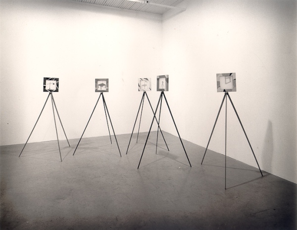
These pieces are about 12" square and an inch and a half deep and they were originally meant to sit on tripods.

The images are cut from 1/8" plywood, and mounted between frosted Plexiglas. The designs on the frames are marquetry in 1950's vintage Formica.

Wednesday, April 18, 2007

Case For an Economical Typeface (space-wise, that is)


Wonderful & illuminating visual aid.


... WELL, sort of "to the wall"... I wrote the following diatribe
for the Eddy-fication of various persons and I hope it had a
little impact.


........... , regarding a probable preference for Tiresias as a typeface on signage, I'd like to interject some notes on why I recommended against it and in favour of FF Transit, . ....

Tiresias and APHont are indeed highly legible typefaces, however, the features that make them so also make them quite wide, due to open, generous counters, wide cross strokes and corresponding open letter spacing. In many circumstances, within the context of a service such as __ _______, available horizontal space is limited more often than vertical space. This means that we will frequently lose any advantages that Tiresias and APhont have to offer by being forced to reduce letter height to fit messages into limited spaces. In the (admittedly limited*) testing I conducted in-house, I found that we'd have to shrink Tiresias and APHont by a little over 15% to occupy the same horizontal space as Transit. With some long place names, limited spaces for sign installations - And the inclusion of a second language which tends occupy more space, this is a fact that can't be ignored.

While all legibility testing is subjective, it was clear to me that when this was taken into consideration, Transit was the most legible typeface I looked at. Also, (as of the last time I looked) Tiresias Signfont is available only in one weight with no italic. When I asked RNIB's John Gill if they were planning to add additional weights and italic variants to the mix he said he'd look into the cost. Shortly after that Sylvie Perera (Human Factors Scientist. RNIB Scientific Research Unit) emailed me to say, "We will be producing the italic and bold versions of Signfont for you as soon as possible." . [Oddly, she made it sound as if she was under the impression I'd placed an order - of course she didn't, but I still had to get her to clarify what she meant.] .... To date I have seen no evidence of italic or other variants When I was making my inquiries about APHont, Elaine Kitchel told me that a full suite was with the fontographer and was "due any day." and it is now available.

... Tiresias and APHont were designed by scientists - Dr. John Gill (RNIB) and Dr. Elaine Kitchel (American Printing House For The Blind) respectively. Or, rather teams lead by them. The characters they designed are individually well constructed so that they read well under poor visibility conditions, and they have been thoroughly tested with subjects who have varying degrees of low vision. But, in my opinion they do not "flow" as well as Transit. An experienced reader scans strings of text rather than individual letters and relies on word-shape recognition and context to aid reading, only pausing to distinguish individual letters when a word-shape is unfamiliar or something irregular interrupts eye movement.

The rhythm of Transit is more consistent than Tiresias or APHont. (rhythm being the balance between positive and negative space - which is important to legibility, as it aids in word shape recognition. There should not be uneven densities of colour to distract the movement of the eye.) I don't think those two fonts stand up as well to that test as Transit. I may appear to be a personal prejudice as a graphic designer speaking, but I do think that an experienced typographic designer will ultimately be better at designing readable typefaces.

Perhaps when comparing typefaces for relative legibility, there may be a tendency to also compare the credentials of the designers… Erik Spiekermann, the designer of Transit isn’t a scientist. He is, however, one of the world’s foremost authorities on the design of type. He is well enough qualified to design a highly legible typeface. He has designed many typefaces and many wayfinding systems including for public transit systems, airports etc. He was a co-founder of the first distributor of electronic type and founder of MetaDesign. He has authored several highly regarded books on design and typography - I believe his understanding of legibility is at the very least, equal to Dr. Gill and includes an understanding of how type works in a signage system. Transit was initially designed for Düsseldorf Airport and is now used on the signage of many German public transit systems. It is also the typeface of choice for some projects in Britain to improver cities’ signage systems. (Example; http://www.bristollegiblecity.info/)

We need to be mindful of economy of space with our signage, as I indicated above and I thin we can do this without sacrificing legibility. Condensing letters to achieve economy of space without sacrificing legibility has been a goal of type designers since the invention of movable type and long before then, among calligraphers, mindful of the cost of vellum. The condensation of letter shapes in typefaces such as Transit is differential, with the greatest amount being applied to letters such as f, r, s, t and E, F, H, L, S, T, where it is easy to simply make the letters narrower without affecting distinguishing feature points. Less compression is applied to letters with open counters c, h, m, n, etc. and even less to letters with closed counters (insides of a, d, e, o, O, Q, etc.).


This is not written to specifically defend the use of Transit as our signage typeface - though I think it serves very well – It is an attempt to defend the use of a typeface that uses space economically and has superior typographic characteristics. There are many typefaces that fit the criteria of economical use of space and superior legibility. These would include Arrival by Keith Chi-hang Tam of Vancouver and M.O.L., by Gerhard Unger for the Amsterdam Metro.

In conclusion, the inconclusive results of the current CNIB study may be accounted for in words attributed to Eric Gill, (
1882 to 1940, known for the classic typefaces, Gills Sans and Perpetua, & no relation to Dr. John Gill): “Legibility, in practice, amounts simply to what one is accustomed to”. Although a little flippant, every joke has a kernel of truth and the truth in this one has been confirmed by research and common sense: Familiar shapes are more legible than unfamiliar ones. Differences in performance between any group of purposely designed "legible fonts" can be vanishingly small and more dependant on what each individual observer is used to reading than on subtle variations in geometry. - Except where horizontal space is limited. Then, a more economical typeface is likely to be better


* In the course of collecting data for the typefaces I examined for the ----- Typeface Review, I contacted all of the vendors to see what additional supporting information I might be able to acquire, and in every case I was directed to the designers, who were all very helpful. I did discuss my method of testing typefaces using uniformly blurred images and a questionnaire with both Elaine Kitchel (American Printing House for the Blind) and Dr. John Gill. They were both very helpful and generous with their time, and both replied that while not a rigorous test by scientific standards the principle was sound enough to give a good evaluation of relative legibility for what I was trying t
o determine. Erik Speikermann’s comments were equally helpful, and since he has a stake in the sales of his typefaces, I’d like to point out he was unbiased. In addition to explaining a little of the history behind the development of Transit, he suggested several typefaces by other designers he felt might also work.


Sunday, April 15, 2007

The Miraculous Gift

God gave unto Adam a gift of a miraculous bottle that had neither an inside nor an outside, and the inside was on the same plane as the outside and the outside the same as the inside.

Adam asked of the Lord, What is this, my Lord? And the Lord said unto him, This is the Universe. Learn from it for here is the nature of creation. And Adam said unto the Lord, I can not use this thing. It will not hold water or wine. I can not fill it with berries and it will not stand up by it's self on the mantle.

After a time, Adam
and Eve considered the bottle and decided to break off the neck and close up the bottom.

God saw this and was not pleased.
What is this have you done with the miraculous bottle I gave unto you? You have defiled it. I gave to you a thing of real physical and metaphysical beauty, that you may study it and see and understand the elegant genius of my creation and you have reduced it to a household object for storing your sour unpalatable wine.

Adam said unto the Lord, Now that we have fixed it so that it will hold wine
and water and given it a base so that it will stand on the table, it is quite nice
.

The Lord said unto Adam, I'll tell you what... That tree over there - Very
attractive, don't you think? Especially in the spring with it's blossoms. and practical too for it's rich harvests of fruit. Do not eat of it's fruit.

Friday, April 13, 2007

An observation or two about a building


I posted the following here - In reply to an article about
Rem Koolhaas' design of the CCTV Headquarters in Beijing. (I should be more diligent checking for typos before hitting "post".) Actually, I quite like his other buildings, and in fairness the only images I've been able to see of this building don't show much in the way of context.


If don't appreciate some finer points of modern architecture, in consequence I may also lack appropr
iate reverence for it's 'A' list names. So... Enquiring minds do want to know: Is it a wonky salute to Stonehenge? A stylized Chinese character? Does the shadow of the V in the roof line trace a particular and meaningful line on the streets below in the light of the full moon on Chinese New Year?

Averaged over the life expectancy of a building, the amount of steel and glass that go into it's construction, I think, must be a fairly insignificant largely an irrelevant consideration beyond the financial contstraints of paying for the materials. No matter how efficient you are, if you build something that shouldn't be built, every ounce of materials is wasted.

Not that this building should not be built... After all, it's not just another glass-box office tower, but a glass-box office tower that has broken out of it's rectangular mould - and into a more oddly shaped one. The building is simply not attractive, and appears to be about style for the sake of style? Different to be different... Not much different from the empty visual calories of a frilly new Easter bonnet -- Except an advantage enjoyed by viewers of Easter bonnets is that no matter how lovely or gaudy it is, you only have to look at it for a day or two. In this way, I think Koolhaas' CCTV Headquarters is the opposite of good design. Particularly for a prominent public building. All images I've seen of it are from the same angle as that shown at the head of this article, where essentially, it looks like an angular donut. Rotate it 45 degrees to the right and, if the renderings are drawn correctly, and I have to assume they are, it is a radically backwards-slanted letter 'z'.

There is something very unsatisfactory about that, as with what you'd feel looking at half a bridge that ends abruptly part way across a river. Nice as a sculptural statement, perhaps but only if there is something that explains or resolves the implied instability. It poses a visual question about balance and purpose that goes unanswered.

Are the exterior walls not vertical simply because, given enough steel, some good engineering and buy-in from the client, you can build walls at any angle you like? I don't think that's a good enough reason to impose such a large and improbable looking building on the people of Beijing. Will they think back with affection on the monotonous architecture and shapeless olive-drab hats of the Cultural Revolution as they look up uneasily at the over-hanging upper floors?

Just a thought.

Thursday, April 12, 2007

Monday, April 02, 2007

The Miscreant:

Introducing The Miscreant:


(logo will show Miscreant stepping out of the red circle)

There is a man with a purpose.
And that purpose is to serve as a bad example to us all.

The Miscreant... Don't do what he does.

Episode #1
OK, Here's how it goes:
The veil is lifted.... Covers are torn back and the lid's blown off, as we dig deep under the opaque layers of bureaucracy for an insider's view of life in a fast-paced government sign shop. Welcome to.... The Dept of Rules and Stuff. (image of office with dafting boards and computers. workers with feet on desks reading or asleep with heads on their desks.)

Miscreant shows up for work - late, causing much commotion. Dis-ordered sheafs of paper under one arm.

Boss scowls - Receptionist with a crush swoons when The Miscreant is mouthy to boss. (Oh, alright... Some of this might be a little fictional.)

The Miscreant has a photo session for new sign. A model poses in circle for photographers and artists while Miscreant directs. (Sign is DO NOT SLEEP ON ROADWAY) proofs are sent around for approvals, there is an after-party. After work, Miscreant goes drinking - gets soused, trespasses into railway ROW and is run over by a train.

Next day he shows up for work. Late - Calls a meeting where he presents a proposal for a new sign....


Thursday, March 22, 2007

The Third Book

The third Farbriano Sketch book was finished in the begining of January this year.
The plan is to do four a year from now on. This year will be tough, because moving to the new house took a big chunk of time, during which I did very little drawing. I even felt like I needed to get back in form and have filled a couple Moleskins to avoid dirtying the pages of a Fabriano book.

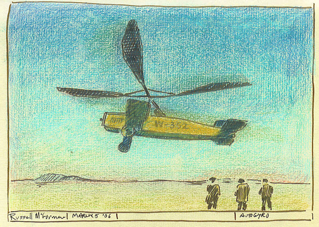
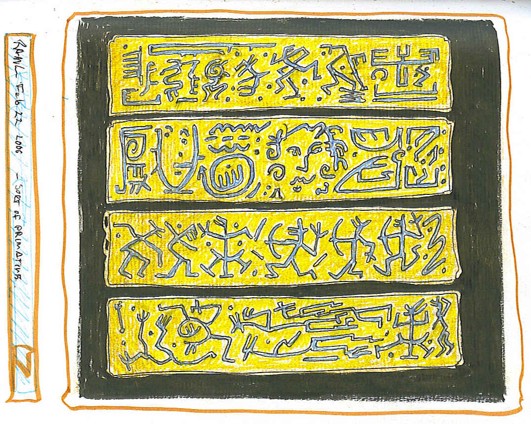
Here are a few samples from book 3.
and here are some more,
in my Picasa album.


I Keep meaning to go in and fix the CSS here.

Wednesday, March 07, 2007

The 1rst of Three Questions.


In the future, how will we communicate?


Asked 100 years ago, this question would have resulted in a fanciful reply that projected wide spread use of the telephone, (envisioned as a wooden box), radio (envisioned as a wooden box) and airmail (Involving biplanes). No one would have imagined the telegraph would become obsolete. Looked back upon from now, such speculations are almost always laughable.. Asked 100 years before that, it would have resulted in a blank stare: "The same as now! How else?"

Having reflected thus, and with speculations reigned in on the one hand and set loose on the other, I will suggest that in the future, our communications will be a guaranteed and unrestricted right and delivered via ubiquitous, freely available means wherein the dependence on actual, clearly definable devices diminishes with time, and where the the overwhelming abundance of information available to be communicated is not an impediment to accessing it.

The telephone in my parents' house when I was very small was in fact, a wooden box on the kitchen wall. It was a party-line and you had to speak to an operator to make a call. If I wanted to make a call, I also had to stand on a chair. The telephones of my children, far from the most elaborate on the market, fold up to the size and shape of a good skipping stone and are can send and receive voice and text communications, access the Internet, store all the address and phone numbers they can use, store and play numerous pieces of recorded music and solve just about any mathematical problem you'd need to solve and tell the time. The technologies being employed become so sophisticated that they near the point where different applications amount to different surface treatments of the same thing. An MP3 player is just a cell phone that is differently enabled. So, where is there to go from there? Better ergonomics? Different colours? More buttons? fewer buttons? Differently conceived buttons!

Those amazing tiny gadgets people now hold to their ear as they walk around the malls, talking about nothing in particular, stopped impressing many of us long before they were invented, back when they were still just props in Sci-Fi movies.

Before long, with achievable extremes in miniaturization and nano technology, we will see the virtual disappearance of devices such as cell phones, I-pods, Palm Pilots, etc. They will be replaced by microscopic chips embedded in fabrics, and other everyday articles and powered by ambient energy.

Hand in hand with this we have to ask what on earth do we really need to communicate, and why? How many things do we do simply because we can do them.

We've heard the complaint that we can talk all the time, but never communicate. I think the real challenge will be how to get past eyeballs and ear drums. The "how" of transferring information from one person to the next is just a part of the process. The part of the iceberg that's visible. It's the easy part. Dissemination of information will doubtless become more efficient:Smaller, bigger, better. We are on the part of the curve that graphs possible and probable improvements in communications, from hollow log and sticks to i-phone and beyond where the level of incline rapidly diminishes.

Language - in all it's forms, both verbal and non verbal, including expressions, gestures, smells, and timing are an other part, but the largest, I think, is how language is perceived both before and after it is transferred. - Are you saying what you think you are saying, and are you hearing what think you are hearing. We know that, as well as one person can construct a statement or question, another person speaking the exact same language can misinterpret it.

This may simply be a biological or Psychological limit. A wall we won't get past.

On the other hand, technologies move on many different fronts towards a common centre.. Once there was biology and once there was mechanics. Physics and psychology. The one had nothing to do with the other. - Now, we have Bio-mechanics. Even Nano-bio-mechanics. starting with what is, even at this time, known about chemical communicators such as pheromone's, auditory and gestural cues, stimulating the brain with low frequency electronics and so on ans so forth, I do think it will eventually be possible for me to know exactly what you mean when you ask. "How we will communicate?" without the filter of language.

I would hope the roll of design here would be to figure out how to avoid the dystopic implications that would attend this level of intimacy. Now is probably a good time to start.

Sunday, March 04, 2007

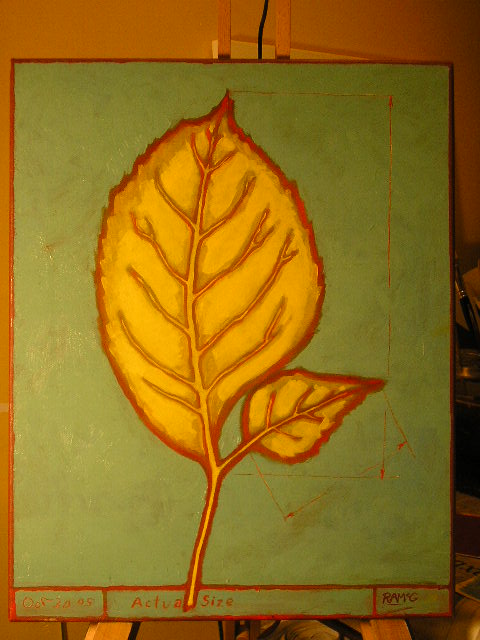
gold leaf


It has occurred to me to apply some gold leaf to this painting. (no visual pun intended.)

Thinking Through Drawing

The following quote is by the Times On Line.

Thinking through drawing

Kettle's Yard, Cambridge

"When John Ruskin set a room full of stevedores to work drawing leaves and pebbles at the Working Men's College, he was not trying to empty the Pool of London and cram the garrets of Chelsea with a new breed of artist. Drawing was an epistemological tool, a way of coming to know what something really looked like; but it also had its moral aspect, since the thing seen and understood became visible and understandable to others through its rebirth as a drawing.

("The greatest thing any soul can do is to see clearly, and say what it has seen in a clear way": Ruskin.) If the results were beautiful in some sense, if they sparked an unfamiliar tremor in the breasts of the WMC's students, then so much the better. But truth, ceteris paribus, was more important than beauty.

The interesting thing about drawing, however, is that in truth it rarely tells you what things really look like. The conventional tools of drawing -pen, pencil or silverpoint, charcoal, chalk, the longtailed Chinese brush -all produce a very imperfect incarnation of something which anyway, according to some, doesn't strictly exist, namely the line."

It is interesting that drawing on the one hand does not "tell you what things really look like" and on the other is the most readily available, most accurate and reliable way of doing so. In part because of the ability to limit and restrict information, and because one learns to draw with the same faculties we use for everything else. In a photograph this same sorting of the relative relevance of the parts of the subject matter is left to the viewer.This may be more democratic, but it is less informative and useful.

Our interpretation of what is in a photographic image and how we read it, it seems, must be subject to the same filtering that is used in drawing an image:
"The very definition of the real becomes: that of which it is possible to give an equivalent reproduction. The real is not only what can be reproduced, but that which is always already reproduced." (Jean Baudrillard )

Our Universe is not only an illusion, Its also artificial.

Thursday, March 01, 2007

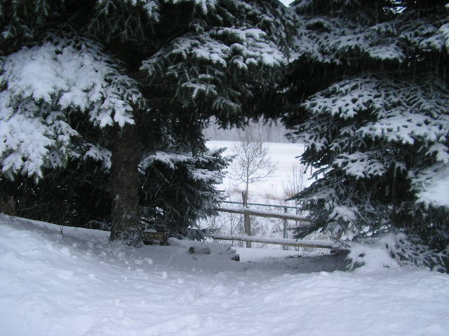
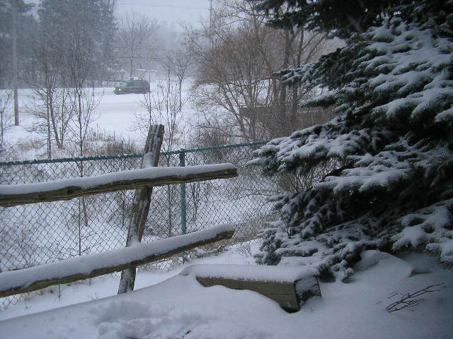
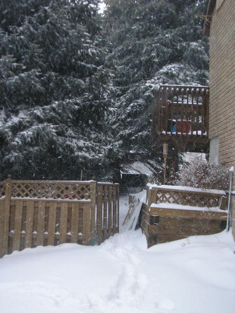
Snow


Yeah, top-posting. Do please stop. This isn't how E-mail works.

I was recently chided in an email for thoughtlessly replying to an earlier email in a form the originating author didn't like: I "Top-posted".

I was slightly annoyed by this chiding . Who needs to be scolded for something as commonplace as top-posting in a business email. What else should one expect from a petit fonctionnair, such as myself? I deal with dozens of emails everyday. They come to me in every format except the one that net-savvy "Internet pioneers" such as himself, would like.

Of the many things I do so poorly as to warrant criticism, this isn't one I'm going to worry about. I'm not going to convert everything to plain text, trim or preface my comments by cutting and pasting the part of their message it is in response to , and I'm not going to try and keep track of occasional email purists so that I can reply to them in kind. Messing with my correspondents' formats isn't helpful to them. It's just confusing. I've certainly never got the impression it is appreciated. I will therefore, without apology or remorse, continue to simply add my reply to the top - Where people expect to find it... And leave their message intact below so that no one on any current or future CC list can form the impression I may have filtered content.

I had briefly considered replying directly to the remark, but, its usually best to keep one's immediate reaction to one's self. A rule to live by... Besides, the imaginary replies kept expanding as I thought of different ways of explaining why I had no intention of following his advice. The following imaginary replies may not be all that funny, but I did have fun writing them:

On Tuesday, February 27, Anno Domini, 2007, at 4:18 in the afternoon, Mr. --- ----- wrote:
>Yeah, top-posting. Do please stop. This isn't how E-mail works.


Citing Parallels from History:

Reminds me of how General Weygand might have lectured De Gaulle in the spring of '40; "Yeah, rapid massed-tank assault with heavy air support. Boff! Je vous interdis! That's no way to win a war."

Empathy is Always Good:
I understand your frustration; my grandparents were pioneers too. They not only baked their own bread, they grew their own wheat. They too viewed with disdain the degradation of standards that seemed to go hand in hand with the conveniences and quickened pace of the civilization they had helped to build. Things as basic as daily door to door mail delivery were taken for granted by their children. For my grandparents, it was a 2 hour buggy ride into town to pick up the mail. As the resolve and toughness of their day became things of the past, the next generation seemed soft by comparison.

Blaming the tools:
When people consistently misuse a product perhaps the problem is with the product and not the users. Then again, maybe it's not a real problem. Perhaps it's those same users who've defined how it should be used, even if only based on how they have become accustomed to using it, because it was a faultily designed product to begin with. (Is that also circular logic?)

When in Rome... Life as it's lived:
In a world of top posters, you must learn to top-post. Doing otherwise confuses people. In practice this is no different from writing a letter. The original would not likely be included with the reply but if it were, it would be stapled to the back. Intact.

Anecdotal Statistics - Who can argue with those?
Of the hundreds of people with whom I've communicated via email in the last year or two, there have been exactly two who did not "top-post", both of whom I'd class as pioneers of the Internet. In practice, it would seem, this is not how email works for over 99% of those people who use it everyday. To rip off a quote from Eric Gill, "[readability (or usability, or etiquette...)], in practice, amounts simply to what one is accustomed to." (The other person who didn't top-post in an email to me was Erik Spiekermann. I respectfully replied to him in kind)

Designer Words:
Top-posting is good information architecture: Chronological hierarchy is respected consistently and in reverse order, like any good filing system; from most recent to least recent. Previous posts are kept intact. Do my readers really need to re-read their own words before reading mine? No. But if for any reason they do, they know where to find them; right there, below my signature, complete with date, time and subject line. Usually in a different colour and indented, just to make the difference between one message and the next even more obvious.

Obliquely Suggesting He's Simply Not All That "With-It":Possibly Even Un-Canadian.
"Newly coined nonce words of English are often spelled with a hyphen, but the hyphen disappears when the words become widely used. For example, people used to write ``non-zero'' and ``soft-ware'' instead of "nonzero'' and "software''; the same trend has occurred for hundreds of other words. Thus it's high time for everybody to stop using the archaic spelling ``e-mail''. Think of how many keystrokes you will save in your lifetime if you stop now! The form "email'' has been well established in England for several years, so I am amazed to see Americans being overly conservative in this regard. "
(Don Knuth)

Regards,
Russell.

This non-top-posting etiquette, ( Netiquette? - Please! Manners are manners.), is simply one of those odd behaviours left over from the "early days" of the Internet, when it was new, exciting and didn't work very well, email was not so utterly ubiquitous and there were no forums. People used email lists to carry on discussions. It was necessary to trim and preface comments because a person could otherwise receive hundreds of emails with dozens of correspondents' posts piled one on top of the other and out of sequence. Before long there would be multiple conversations under the same subject line, and most comments would be something like "I think --- ----- is full of crap." with no easy way of find out what --- ----- had said to trigger such a passionate dismissal.

Now-a-days, there are on-line forums that manage such chaos quite well. The only people who use email lists anymore are either so backward they don't notice the chaos and are still awed by fact they don't have to kick off their slippers, pull on their black and rust-red wellies, walk down the muddy 200 meter driveway and across the concession road without looking left or right, because there'll be no cars and thus no point in doing so, to collect the mail, or else, they are web designers and programmers to whom the chaos is invisible, because they grew up with it. Like good mechanics they know how to keep an old clunker going and all they see is that it is still going. Obviously they also get a kick out of the anachronism of it all. These same people have, (or wish they had) ring-tones on their phones that perfectly mimic the bells on rotary dial phones. I know this to be true, because I myself once received about 250 emails a week from Usenet lists I subscribed to, and - If I had a cell phone, it would have the deliciously rich tone of a classic black Bell Canada Model 500 dial phone.

Plain text emails, trimmed content and posting the question or comment being responded to , together with the author's name and the date posted and indicated by a corner bracket ( > ) above the reply are meant as courtesies to the reader. This is a generally agreed upon and expected form, commonplace to many who have communicated a great deal via email, and it works well. However, in a world where I would be the only person doing this, why would I do it? It is, after all, a burden that I would bear for the benefit of my readers. They, however are not returning the favour. The agreement in the Corporate and Civil Service Office world, as I have come to know it, is that it's the reader who brings order to the chaos. The author just adds to it and everyone seems to be fine with that. It's the same burden either way and it's fair.

Tuesday, November 07, 2006

More George

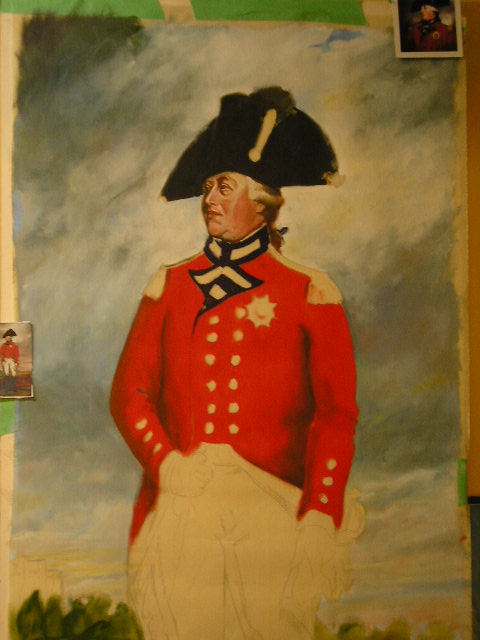
The third evening working on this painting, and this is what it looks like.
It will in fact be done by tomorrow, leaving 2 days to dry. It's a curious substrate to work on. It's a light raw cotton that was heavily laquered. The laquer seals the fibers, but the paint still goes through the surface. The laquer also stifens the fibres and makes them abrasive so it's pretty hard on brushes.

The cotton originaly part of some older pie
ces, from a YYZ show.

At the bottom of this post is the painting I am copying - Which itself turns out to be a copy - (and not a terribly good one at that), of a Willian Beechey, painted in 1800. Mine of course is by far the least well executed painting.


Monday, November 06, 2006

Whole lot-o-George

A couple of stages along the way... King George III, whom I am painting as a piece for the King's War of 1812 Re-enacting group I belong too, for the annual King's Regimental Mess dinner.
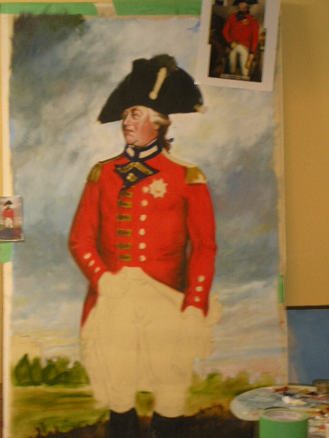
It seems that at one of the real 8th Regiment's dinners while they were stationed in Quebec during the War of 1812, they had a lavish display set up for their guests, complete with a life size transparency of the King, lit from behind by candals... It's entirely possible that theirs was, like this, a copy of Beechey's 1800 portrait of George III. It was copied a number of times. Presumably as an official portrait. I Know if I was king, I sure as heck wouldn't want to be sitting for a new portrait every time they opened a nwe government office, so I get one good one done up and hire a competant but less expensive portraitist to churn out copies. Not that HRH George III did that, but I've come across several versions of this painting by lesser masters than Sir Beechey. In each the King is in s different setting.


I have until the 11th to finish this. I'll post a photo of it after I'm done, and when it is set up at the mess.

I think it may look rather wreched if it is only lit from behind, because it is hard to judge the transparency of the paint. We shall see.

It's good practice.

Sunday, September 10, 2006

In the Box


I came across the original gallery photos of these recently. This was a part of my graduate exhibition when I was at OCA. 9 6' x 6' panels. The construction of these pieces consisted of oak frames with lacquered cotton stretched on both sides and plywood cut-outs of a camera, a lamp, a table, a chair and a window with the cotton on one side being painted red, yellow or blue. the pieces onontripods were plywood, plexiglass and fifties Arbourite (Formica)on tripods were plywood, plexiglass and fifties Arbourite (Formica)

I milled the oak for the frames down from 2 X 10 rough cut planks. It was quite the project. The legs on the tripods below were walnut and oak. I loved working with the walnut.


Saturday, September 02, 2006

Any How


well, It has been a while since my last post.

two months to the day in fact. In that time, we have bought a new house, gotten our own house ready to sell and put it on the market.

Any how - this blogs about - What?


Sunday, July 02, 2006

The Second Fabriano Book is Finished

Book #2 is now full. Here are some drawings from that book which I hadn't posted before. (Ach, This layout is irritating.)

Coloured pencil. I went over this with a clear wax and polished the surface. and while it did enhance the colours, it also caused the wax in to coloured pencils to sort of "pill" and become muddier.


Coloured pencil.
They eventually fixed this flag by cutting off the torn panel.


Water soluble coloured pencil and water based markers (flouresent highlighter pens)


Pencil, pen, highlighting marker, white, yellow and blue Stabilo pencil.
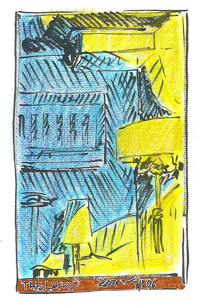


Pencil, pen, highlighting marker


Pen, water soluble markers and black Sharpie.


Pencil, sepia brush pen, highlighting markers.
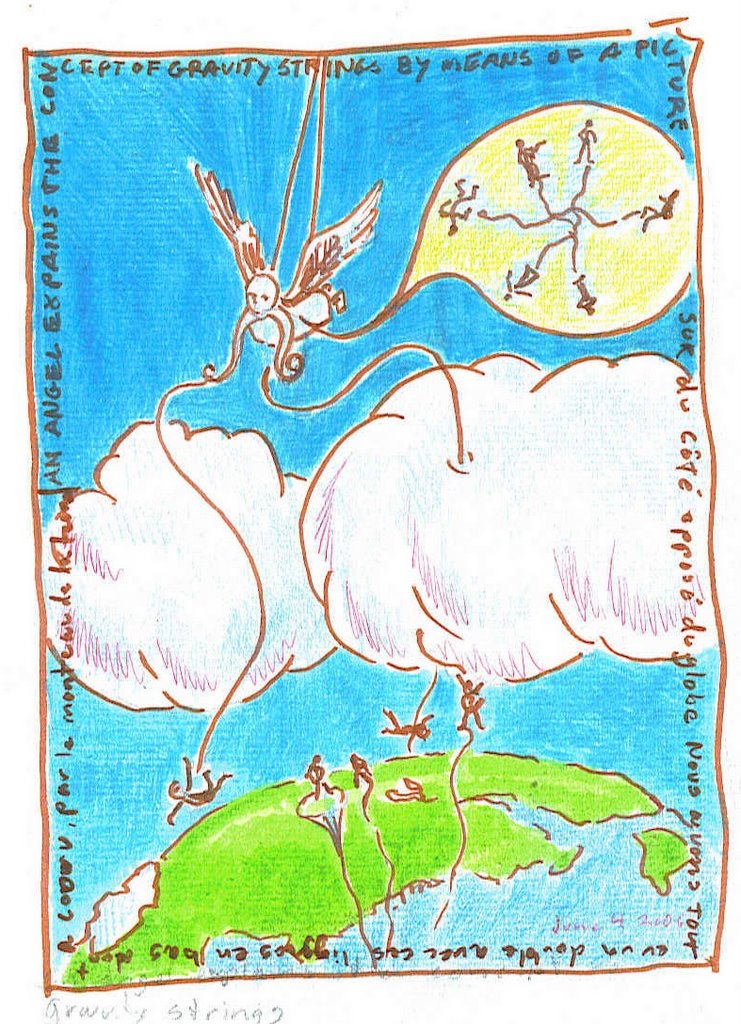


Gravity strings. pencil, coloured pencil, water soluble marker, pen