Wednesday, March 29, 2006

The Three Amigo-Bots


The back-story so far...

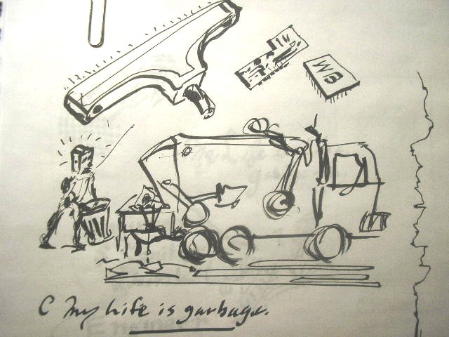
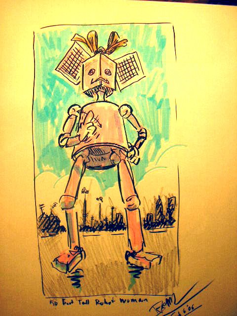
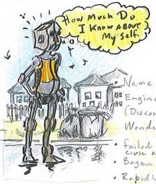
The main character is ESR-A (Engineer Sanitary Robotic -Type A) a robot who started out as a military Artificial Intelligence experiment gone wrong, and was eventually sold off to a civic sanitation department as a robotic garbage man. He develops emotional attachments to discarded appliances and tries to rescue them. This doesn't go down well with the sanitation department and they want to scrap him, so he runs away and becomes a renegade robotic garbage man/Don Quixote's/My Favorite Martian type. He is not well made, his parts don't fit well and he's not running on all transistors. he has some rather remarkable capabilities from his "Army Days" but they are iffy at best and sort of underwhelming.

The foil is a robotic garbage can named Poubelle Libre, who is a female self-loading garbage can/Sancho Panza on wheels. I'm thinking the techs on her development team might have thought they were designing a self-loathing garbage can. She has run off and become a renegade also. She hooks up with the hero and helps him rescue appliances.

The antagonist is GLRR-BIN. a robot with a similar history to our hero's, but is even less well designed and less clever. He is very ungainly, ugly as all getout. He was designed as a paper shredding Bot to find and destroy sensitive documents and other refuse, but he is slow and dim. His one remarkable bright spot is unintended and unfortunate. He chews up documents and excretes lists. He was at some point tasked to to capture and destroy the hero, but was so inept that he was to be scrapped also. He joins the hero and Poubelle, but is always on the verge of turning them in. He is too much of a conformist to truly rebel. GLRR-BIN is basically a walking box. He looks and is powerful, but the power is useless. His massive arms are not capable of lateral movements and are only for lifting paper and small objects to his huge rectangular, paper-shredding mouth and his powerful legs are short stubby little things with no articulation. He is not capable of speed or movement on irregular surfaces. Stairs will be a challenge.


They live in a "mixed use" nieghbourhood on a residential street. The view out the back of their home is of industrial buildiings and a distant city scape. Their house is the one under the high tension power lines. It is a small factory building or somethng like a railway switching tower. They live there in hiding, although only nominally so. ESR-A occasionally has to disguise himself, and they have to keep an eye out for Sanitation Department inspectors. The yard is littered with broken appliances. most nieghbours are blasé but there is at least one Mrs Kravitz (or Mr.). they need to deal with from time to time.


Thinking About Where to Start Designing A House


Because,

the future will be a little

different.

We will need to be too.

I work in public transit. I do this because it pays the bills, but equally important, I do believe in it. So, I sort of naturally want to start exploring what a good house is by exploring my interest in all aspects of moving people about from more or less sustainable house to hopefully sustainable workplace and back. Without spiraling off into another subject altogether, how will streets, bus stops, train stations, bike paths and autogiro pads look and work in communities of the near future. I'd like to examine how personal and public assets could be thought of and treated in a more civicly responsible manner first, the decide on the house.

An holistic solution to current housing problems, throughout the world, would start with an acceptance of the real estate dictum that the value of housing really is all about "location, location, location", but redefine the meanings of "location" and "value". City cores become over-valued for housing, forcing those who depend on work in them to locate further and further away - To the places where "there is no there there". To the endless sprawl of modern cities' suburbs and shantytowns. What if it were possible for people to live closer to the places they work?

What would happen if public transportation were so good that no urban dweller needed a car? Would people then be willing to pay a significant portion of the money they no longer need to spend to own and maintain a car on taxes or fares sufficient sustain public transport and alternative infrastructures? Would they appreciate the cleaner air and greener and improved health of their city enough to offset the loss of that womb-like privacy of traveling in a personal car?

I'd like to find out if streets are even necessary. In terms of the total expenditure of energy, time and road usage, would it be better to deliver groceries and other necessities door to door rather than via millions of inefficient, random and often rambling shopping trips by individual house-holders? As it is, millions upon millions of people in North American and European suburbs cannot buy a loaf of bread or a litre of milk without getting into their car to drive to the store and millions of shantytown dwellers need to walk half a day to get a day's supply of water.

I appreciate that some of this may not be what comes to mind in a project to design a better house... But even a perfect house must exist within a community, and to achieve it's potential, it may be necessary to redesign the community, including the complete infrastructure in order to maximize the potential of one house.


Thursday, February 02, 2006

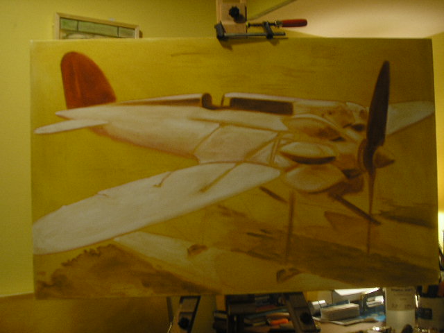
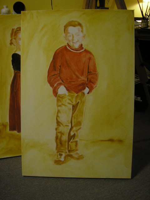
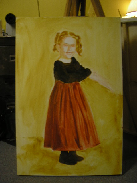
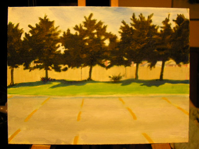
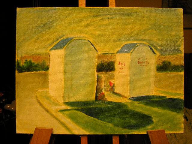
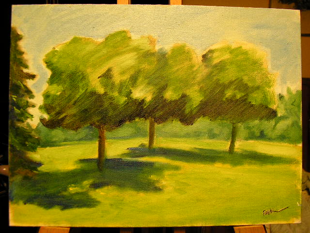
Progress Report on Re-learning to Paint.

I started these last night. They are oil on canvas, 24"X36 for the portraits and 22.5" X 36" for the plane.


Friday, January 27, 2006

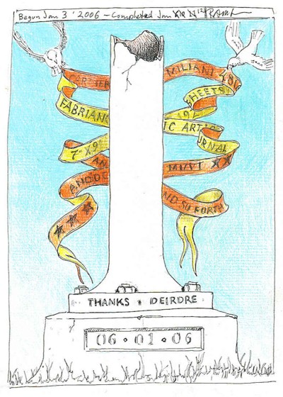
The First 11 Pages


About 5 days into the New Year I finished the first Fabriano sketchbook. 192 drawings on 7" X 9" paper - I think about three were scrapped and cut out of the book and two pages were just used for testing media. You can read a little about the first book in the third post in this blog.

So
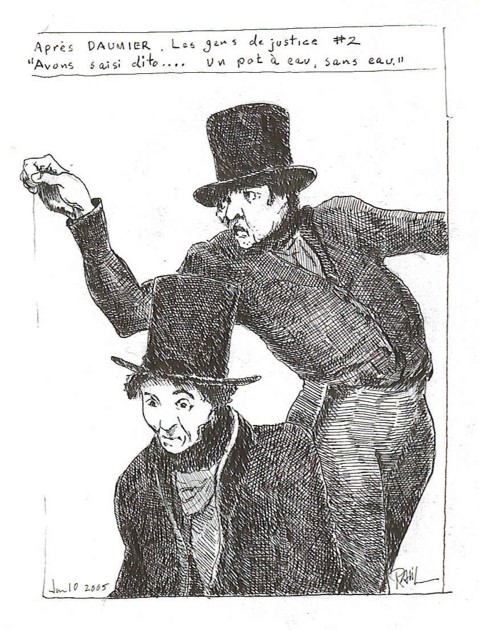
, these are the first 11 drawings in the new book.

#1 Frontice
#2 Curtain Up At The Bloor,
#3 copy from Daumier.
#4 same
#5 Parking Lot At Loblaws.
#6 North York Centre
#7 The Tall Guy In Front, Bloor Cinema
#8 Elizabeth Street, (this is where I wait for deirdre when I go to pick her up after work.
#9 Elizabeth Street Parking Meter,
#10 Supper At Te Drake. (Waiting for
my order to come.)
#11 North York Centre Tower (De Chirico Comes To North York)


A Label Gallery Show


Flyer looks pretty good.

Wednesday, January 25, 2006

Possibly, Perhaps.

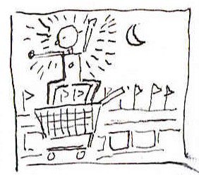
What I need to do is post some of the stuff from the cartooning class Deirdre and I are taking.

Wednesday, January 11, 2006

Some Images

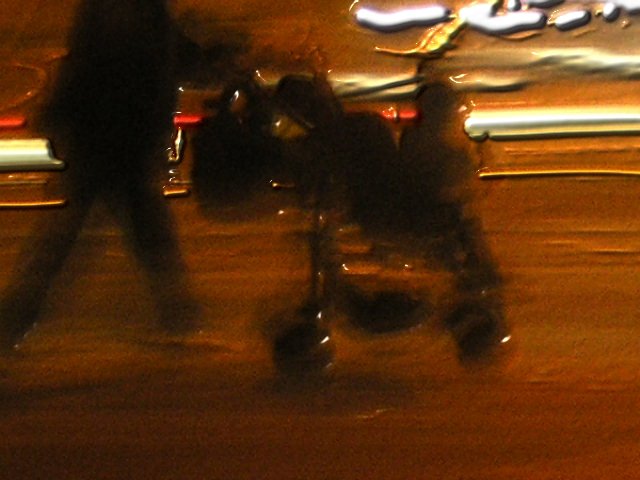
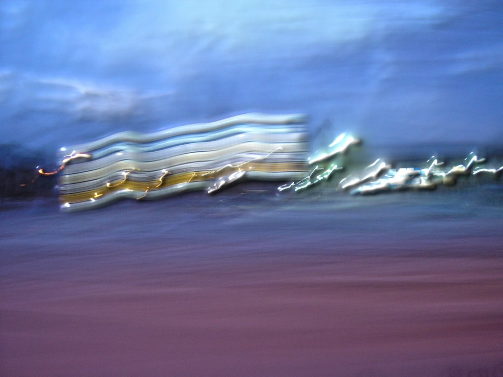
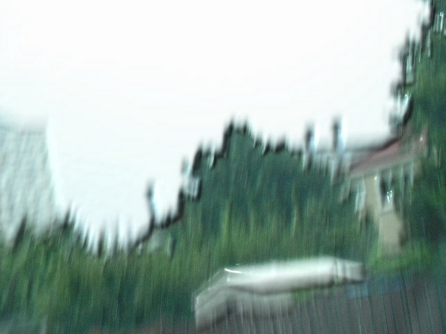
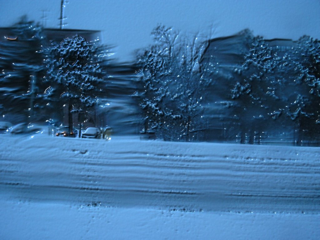
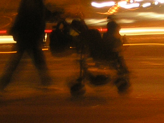
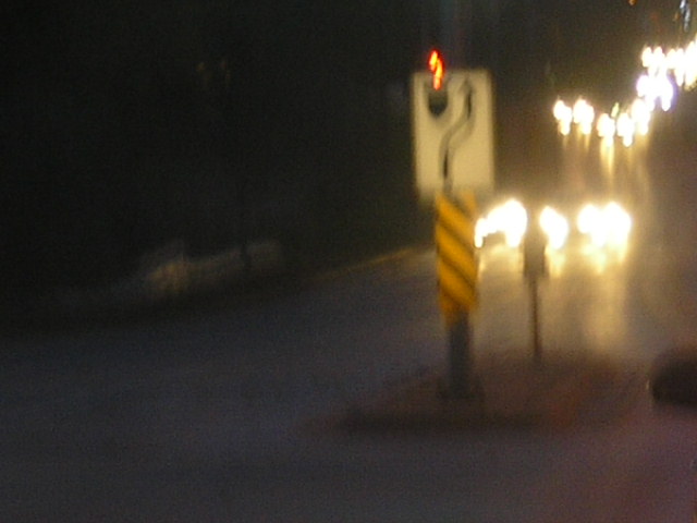
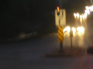
-- Taken with my Olympus D-540 point-and-shoot digital camera, at night - illuminated by street lights or predawn ligh. Camere settings on "bright sunlight", max optical zoom, while moving the camera.
Corel Photo Paint filters applied.
#1, China Town, Dundas and Elizabeth Street, from Elizabeth Street, across from Japango, looking north towards the bus terminal.
#2, 16th Ave. west of Warden. This was a van turning the corner with the reflections of passing cars
#3, 16th and Hwy. 404, the northbound on-ramp and the light poles in the median.
I should provide Google Earth links to the exact locations each image is from. It really doesn't matter where the photos were taken since there is little or no resemblance between the image and it's location. Or, it is a resemblance that is difficult to glean as the elements of time and motion have been added.


Tuesday, December 20, 2005

I Heard It Called The "Buggy Corral"

"Buggy corral"?
Now that conjures up an image:


The sun's hangin' low over the Arbie's sign. It's the end of another long day for the buggy wranglers. A long day of wraslin' buggies, cuttin' out carts and herding 'em into the mall - All the while, fighting off buggy-rustlers and dodging distracted drivers. The cart-pokes gather 'round the corral for an impromptu rodeo. Before long, someone's pulled out a guitar and is singing "Buggies Lament " as he sits on the top rail, slouched over the instrument with a hand-rolled cigarette hanging from the corner of his mouth, one eye squint tight against the smoke:

Whoopie-ti-yi-yo, get along you little buggies
It's your misfortune, t'ain't none of my own
Whoopie-ti-yi-yo, get along you little buggies
You know that the Loblaws will be your new home.


It's twenty four-seven that we round up the buggies
We push 'em and shove 'em and bend up their wheels
We round up the loose ones, line 'em up by the score,
Then send them damn buggies a-rattlin' though the front door.


Someone else is passing 'round a hip flask of cheap rot-gut whisky. An injured cart-poke is helped up after being tossed from a cart. He takes an extra swig as he picks grit from the road-rash on his elbow.

As the sun sets behind the the Red Lobster a cool breeze picks up and fluffs flyers and coupons left in the buggy baskets. The conversaton inevitably turns to the buggy stampede of '03. It's a hard life on the asphalt desert. Hard and short and spent like summer wages.
-------------------------------------------------------------------------
I'll need to get some good images to go with this :o)

Monday, December 12, 2005

Fuzzy Photos


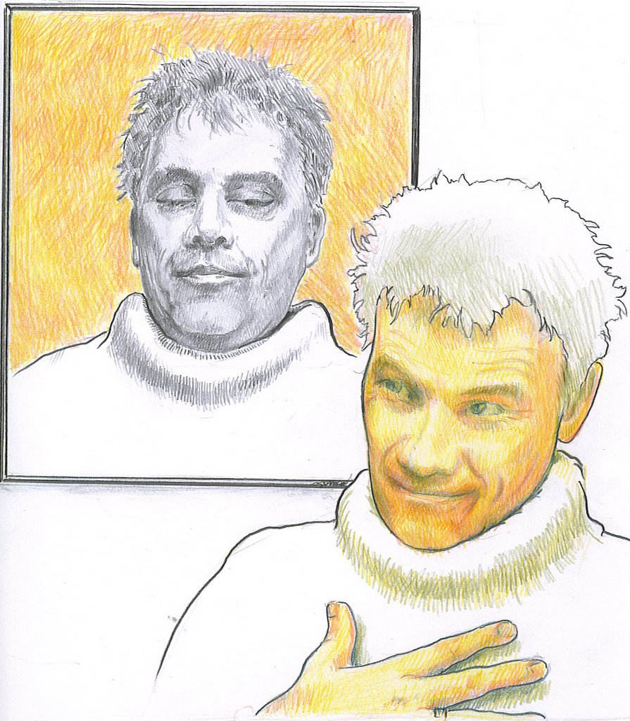
Self Portraits


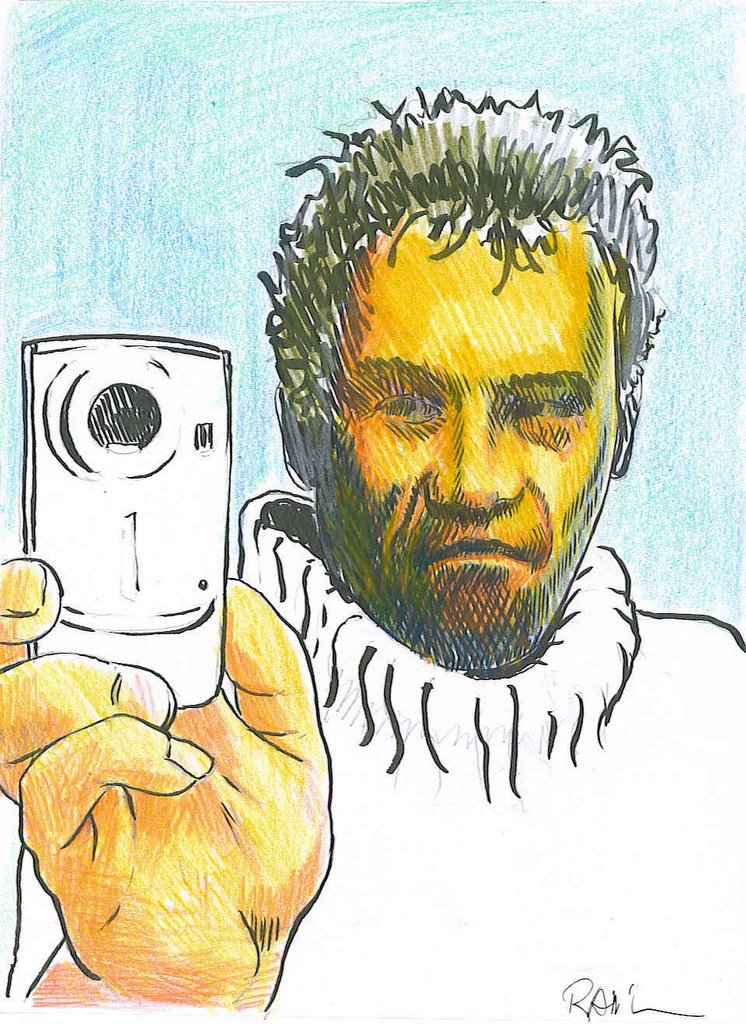
These were from a figure drawing Course I took with Deirdre at George Brown College.

Pencil and coloured pencil.


Pencil, brush pen, and colured pencils.


Pen and ink.


The idea was to show some expressions.

Thursday, December 01, 2005

On the subject of blurred vision

Much to my delight and very unexpectedly, I've been invited to participate in a group exhibition of art, opening in Winnipeg and touring to Kitchener and Montreal. What seemed to get the attention of the organizer, James Culleton was my "fuzzy" photographs, fitting with the theme, of "blurred or double vision" as they do, of course. So I've thought about how my work fits into that theme. I'm trying to decide what pieces it include.

I don't often like to do things without a reason. Or a sense, at least, that there is a reason. The reasons may often arbitrary, and clouded in uncertainty to be sure. As we navigate through life, both physically and metaphorically, we try to attach to some sort of firm ground to provide a sense of certainty about who, where, why, when and what we are - In relation to everything else. Sort of a "You are here" sticker on a mall map. In this context, I see blurred vision as being synonymous with uncertainty.
I'm a graphic designer. My area of expertise is wayfinding signage. I'm employed by a transit agency and a large part of my job recently has been the background work on redesigning our signage standards. When one is designing such a thing, it is important that it look good, but the first item of concern is function. You don't just change something because you feel like it. You need a reason, and the reason needs to be the right one. Who does it serve and how can we make it functionally better and not cost too much...

An actuality is that not only is the demographic mix of passengers getting a little older but most of our passengers catch their trains before sun up and after dark for most of the year and in all sorts of weather. After taking the train once, you pretty much know your way and never need to look at directional signs again. It's not rocket science, but with growth and the turnover rate, as people change jobs, find other ways to get to work, etc. There are hundreds of people every day who are new to the system. People are rushed, distracted and not fully awake while trying to find their way to the right train, figure out how to by a ticket, when the next rain arrives and so on. A sign is virtually never needed when viewing conditions are ideal, so we needed to find a typeface that could be demonstrated to be more legible than all others in all viewing conditions. I did this by selecting a few that were design to meet those criteria in the first place.
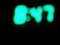


They were; Tiresias, designed by a team of scientists at the RNIB ((British equivalent of our CNIB.)) APHONT. Designed by a similar team at The American Printing House for the Blind. ClearviewHWY, designed by a graphics firm in co-operation with Transportation engineers and thoroughly tested in all weather conditions using cars moving at highway speeds on a full scale test track. ((Subjects were tested for the distance they were from a sign before they could read it and how long it took to read.)) And finally, Transit Font FF, designed by Eric Spiekermann for MetaDesign in their German office , to meet requirements for improved signage after a fire at Düsseldorf International Airport that killed quite a few people. It is now used by quite a few German Public Transit Agencies - Hence the name, I guess. The typeface we have been using is Helvetica.)

I then had signs made up in all the different faces photographed them and blurred the images digitally. I then asked people the read the signs and had them rate the legibility of each character in the sign on a scale that ran from "can't tell what letter is al all" to absolutely certain what letter it is" From that exercise it was I was able to choose and back up my preference for Transit Font FF over the rest, based on relatively objective criteria. (Second most readable at identical letter heights, but since is more compact, you can use larger letters in the same space.) It also happens to be the best looking of the lot, which is a bonus.
Any how, To get back to the subject of making art and embracing uncertainty...

Sort of a follow the dotted line idea, but you rely a little on their logic and a little on your ability to communicate visually, but in the mean time, there is a lot of noise to interfere with both. (the dots maybe very far apart and not easy to see at first) Imagine trying to find a washroom at a mall. You start with some basic reasoning:

  • the mall wants you to be able to find the washroom on your own, possibly because they are nice and want to help, but more likely so that shoppers will take up less time of the employees of the mall and their tenants, who would otherwise be asking where the bathroom is. - So there will be signs.

  • B: they don't make any money off the washrooms so the signs will be discreet and out of the way of advertising and they will be grouped with other similar signs pointing to other services.

  • C: Architects hate directional signs, so they will be more discreet than the should be, but the signs will be at points where you need to decide which direction to take.

  • D: The wash room will likely be near where food is served. (not for your convenience. They have to, but because that's also where the plumbing is.)
So, there are certain things you know at the outset. A set of logical conclusions you can make before you begin looking, even though the design and layout will be different in every mall. There is still a degree of uncertainty until you can picture where you are in relation to where you need to be. Once you know, you can relax. With my art, I want to take that certainty away. It's about looking for things. Not finding them.What I found with the type face tests was that (mostly with Helvetica), certain letter shapes would close when blurred: The letters s & a and e could be come indistinguishable. Other letters or combinations of letters are the same shape, as in the word 'Ill' for example. We read by word shapes as much as by letter shapes though, so even if you can not identify any letters in a word you can make an educated guess about what the word is, and when the word is in context, you can be 100% certain. The process is slowed down though, which is why it is an issue in wayfinding signs. On the other hand, it is interesting how much information we can dispense with and still function.

Friday, October 14, 2005

In The Interval


Between now and my last entry Deirdre and I have signed up for a drawing course, Saturday afternoons at George Brown College. We like to do things like this together. We are also learning to speask French at The Alliance Francais together, two nights a week. She's in the level ahead of me, because, well... Because she's just that much smarter than me. We still do the Wednesday life drawing sessions at the Gladstone.

This coming Saturday will be the grand re-opening of the Gladstone. From what I have seen so far, it is going to be pretty terrific.

Thursday, September 08, 2005

Life Drawing And a Beer (or two)


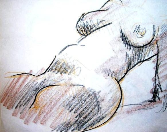
WE have been attending an informal figure drawing class at the Gladstone Hotel, in the "Art Bar" (so called because of the weekly figure drawing classes, ongoing since 1968). We buy ourselves a beer, then sit in the company of some really quite accomplished artists and draw.

This has become something My wife and I look forward to: Two and a half hours of 2, 3, 5, 7 and 10 minute poses. I hadn't been drawing like that for many years, and at first anything under 5 minutes seemed like and impossibly short amount of time to turn out anything that wasn't embarrassing. Even 10 minutes was too short. Now, after a few months, 10 minutes almost seems to drag.

I'm still very rusty with the heads and faces... So,naturally, in the guise of artistic licence, I've been leaving them off.

I'll try to work up to it.


Eventually.


Friday, August 19, 2005

The Fabriano Classic Artist's Journal

In October, 2003, my wife bought us each a 6 1/4" X 8 5/16" sketch book. 192 pages of a very nice, slightly toothy Fabriano drawing paper. Cartiere Milani Fabriano was founded in 1282, in Fabriano, Italy and is the oldest paper mill in Europe. They are credited with inventing the process of embedding watermarks in paper and gelatin sizing to make paper more receptive to ink and paint and more stable as a medium for documents. I could mention at this point that my wife and I share a delight in the texture, weight and feel of a really good paper.
Fabrianlo
makes some of the best.


The vary first thing I did was draw a title page. After that I was a little hesitant
to draw in it. It invites sketching. Doodling even, yet I didn't want to sully the pages with - Just anything.

Recently, though I have been taking the book with me every where I go and drawing in it if I have some time on my hands. This started when my wife was working late and I'd drive downtown or to the bus stop to pick her up. I'd draw what ever was in front of me while I waited. I began to carry a variety of drawing supplies as well.

I try to do a drawing a day in it. In
reality I manage 3 or 4 a week. More so since I started going off during my lunches to draw.

Thursday, August 18, 2005

There Were Fault Lines In The Electromagnetic Field.

There were fault lines in the electromagnetic field.

You could map them out following a sequence of Lorenz graph plots, spanning vast periods of time. They would show up in weather patterns and earthquakes. They would show up in crime statistics, unspeakable atrocities, wars, UFO and Virgin Marry sightings. Pins on a map of natural and man-made disasters. Boulders under a fast moving stream revealed only by turbulent disturbances in the current.

Finding that pattern was next to impossible. Once found though, tracing a line forward would inevitably take the observer to a sweet spot - A precise set of coordinates where, as with finding the the stone in the stream, if you caefully trace a line back up-stream, you may find the precise place and time where you can drop a leaf and know, from any distancer, it will go neither to the left of a sand bar nor the right, but run aground like an unlucky sailor. The art is in knowing where to look, and when. The science is in narrowing the range of probabilities and tracing the line back as far as possible.
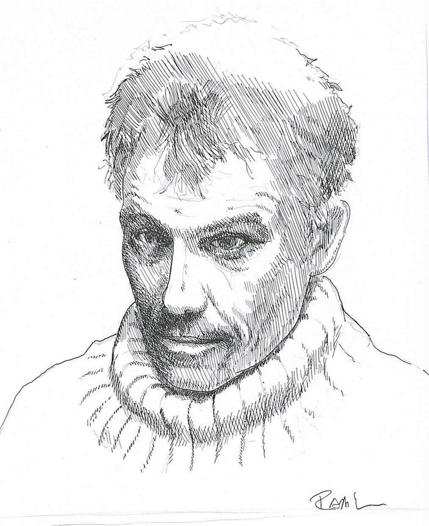
These Spots are active.

Tuesday, August 09, 2005

I Have Seen the Enemy's Weapon And It Is A Fuzzy Photograph

... Which means, what? It was a line from a story I wrote many years ago. Something sureal about it. I liked that. Still do. I no longer have the story. Just the line and a fuzzy recollection of a "B Street" and a plant with machinery inside that rattled windows in surounding run down, turn of the century industrial buildings, and the protagonist was always threatening to blast the listener. The fuzzy photograph is a sort of vague memory and not a partucularly valued one at that. At least not by most.


I'm not sure where to go with this Blog.
Stories/photos/drawings? Maybe all.