

Sunday, December 30, 2007


Wednesday, December 19, 2007

Tuesday, December 18, 2007


Monday, December 17, 2007


 I am about half way through book five of my Fabriano Artist's Journals. Every day, I try to make at least one drawing in these books. Some days I'll do as many as 8 or 10. Others none, and still others I will go back and complete a drawing begun earlier. Several doctrines apply to how these drawings are produced. Since the practice began as something to do while I waited for my wife, who had to work a lot of overtime at the time, I just
draw what ever is in front of me. Essentially, this boils down to
 a lot of "what ever was in front of me at the time".


Sunday, December 02, 2007



Tuesday, November 27, 2007
And then there is this crazymaking type thing
I have not been able to find any documented or demonstrable legitimacy behind Tiresias as a Signage typeface. The "scientific" claims said to support Tiresias Signfont are flimsy at best and not even relevant to a signage typeface. All the evidence that is referred to on-line is from testing of Tiresias Screenfont, which is intended exclusively for use in captioning on television screens. This is a unique application of type because of the low resolution. I can find no reference to any testing by RNIB of actual signs in any form. It appears that assumptions were made from testing of Screenfont and extrapolated to fit someone's idea of a typeface for signage.
A review of the backgrounds of the team members involved in the development this typeface reveals that no one with any substantial experience with signage or type design has worked on the font. (Design of signage is not listed on the Laker-Sharville web site as a one of their capabilities). The research done by the [----] is already just about equal in scope to published results from what has been done by the RNIB and the Tiresias team, and it doesn't show Tiresias to be any kind of Magic Bullet for improved legibility compared to other comparable typefaces.
A careful reading of the documentation behind Tiresias leads me to conclude that Joe Clark is absolutely correct in his assessment of the typeface. His commentary is entirely about Tiresias Screenfont, however, as it would appear that the Tiresias team has done no more than make assumptions about what a signage typeface should look like, based on conclusions made about Screenfont. It is therefore as relevant as any other commentary available about Tiresias Signfont, either pro or con.
The following is my own summation of the development, support and validity of Tiresias Signfont from reading the relevant reports and documentation of this typeface:
One has to ask, how likely is it that a team of scientists with no knowledge of design or typography, and a novice type designer are going to come up with something that hasn't been thought of already in the last 550 years? In modern times, people have become more aware of legibility of signage and screen typefaces, however, the exact same principles apply, except, due to distances and low resolution, simpler shapes (sans serif) and increased tracking are helpful. The key factor is size and you don't need science to tell us that.
As noted elsewhere, I am not defending FF Transit specifically. It was chosen out of a small, predetermined field and it turned out to be a significant improvement over Helvetica. There are other a typefaces available that meet all the criteria for signage for public transit (legibility, economical use of lateral space, versatility, etc.) FF Info would be a good alternative choice as would Arrival, by Keith Tam or M.O.L. , by Gerard Unger, all specifically designed for wayfinding signage in a public transit environment. Our intention from the start, has been to make our signs more legible and therefore more accessible. I think the differences in legibility between one good quality font and the next will be very small and not worth the effort and expense of measuring. It all comes down to some simple geometry and the metrics of letter spacing, x-heights and etc. that make up the basic information that reaches the eye.
A review of the backgrounds of the team members involved in the development this typeface reveals that no one with any substantial experience with signage or type design has worked on the font. (Design of signage is not listed on the Laker-Sharville web site as a one of their capabilities). The research done by the [----] is already just about equal in scope to published results from what has been done by the RNIB and the Tiresias team, and it doesn't show Tiresias to be any kind of Magic Bullet for improved legibility compared to other comparable typefaces.
A careful reading of the documentation behind Tiresias leads me to conclude that Joe Clark is absolutely correct in his assessment of the typeface. His commentary is entirely about Tiresias Screenfont, however, as it would appear that the Tiresias team has done no more than make assumptions about what a signage typeface should look like, based on conclusions made about Screenfont. It is therefore as relevant as any other commentary available about Tiresias Signfont, either pro or con.
The following is my own summation of the development, support and validity of Tiresias Signfont from reading the relevant reports and documentation of this typeface:
- The Tiresias project was conceived as a project to improve captioning on TV screens.
- Making a signage font was an after-thought.
- A 'professional' typeface designer was brought into the project late in the process - Essentially to clean up what had been already created and to convert the letter glyphs into font files. This actual typographic work on Tiresias was done by Chris Sharville.
- Tiresias is evidently his first attempt at a typeface. There are no others credited to him on the market, and Tiresias is the only typeface listed in his portfolio.
- Creating, or even editing an existing font, is a very complex task, and it is a lot to expect of a designer to master all of the subtleties required in a first attempt. A review of Mr. Sharville's on-line portfolio will reveal that he is a competent designer, but not exceptional.
- The typeface (Screenfont) was tested on 35 visually impaired subjects and 48 hearing impaired subjects, (plus a small number of guides and sign language interpreters) using simulations of TV captions instead of actual captions.
- As with the ---- tests to date, subjects who participated in Tiresias font trials did not represent an average demographic group.
- Tiresias Screenfont was only tested against two other fonts; Times New Roman and Standard Alpha-mosaic. Times New Roman, with serifs and a lower x-height, will not reproduce very well as small text on a TV screen and Standard Alpha-mosaic is a dot matrix font (they used 7X5 dots and 9X10 dots). It would be difficult to find a sans-serif typeface that was not better than these two for captions on a television screen. That they would choose to compare these typefaces for any reason seems to indicate a remarkable ignorance of Typography.
- All typefaces were set at 14 points. Point sizes are nominal and measure the the distance from the highest ascender to the lowest descended plus some empty space. Times New Roman has a lower x-height and is visibly smaller than Tiresias set at the same point size (by about 10%).
- Tiresias Signfont was designed based on assumptions from the research on Tiresias Screenfont.
- The report states in it's conclusions; "It is freely admitted that this "testing" is far from ideal and could even be described as anecdotal."
- All references to scientific research in support of Tiresias Signfont point to material about Tiresias Screenfont and "Access Prohibited?", a British website about guidelines for barrier-free environments, which is as vague as similar North American documents, in that all it says about typefaces is that larger text is more legible.
- There is absolutely nothing in the literature about the development of Tiresias that describes how the design and the geometry of character shapes and the metrics of letter spacing and kerning has been treated differently than in other typefaces that hasn't been axiomatic to the the world of type design for at least a century.
- Tiresias is a bold single-font typeface with no light or medium weights and no italic. Having only one weight with no italic removes the option of ever using emphasis to call attention to important information while adhering to the graphic standards of a signage system. ( --- says that Signfont now has italics and a lighter weight, however, we should believe that when we see it. There is no mention of this on-line and they are not for sale anywhere.)
- For a modern typeface intended for signage that's legible to persons with poor eyesight, it is odd and disappointing that there has been no consideration given to the effects of halation for back lit and retro-reflective signs or the 'dazzle' effect of white type on a black background.
- Browsing through the specimen books of any major type foundry will turn up numerous typefaces that have all of the characteristics Tiresias infers are unique to their typeface in aiding legibility, with the exception that these other typefaces will have multiple weights and italics - and look better. If the initiators of Tiresias Screenfont project had known that, would they have bothered?
One has to ask, how likely is it that a team of scientists with no knowledge of design or typography, and a novice type designer are going to come up with something that hasn't been thought of already in the last 550 years? In modern times, people have become more aware of legibility of signage and screen typefaces, however, the exact same principles apply, except, due to distances and low resolution, simpler shapes (sans serif) and increased tracking are helpful. The key factor is size and you don't need science to tell us that.
As noted elsewhere, I am not defending FF Transit specifically. It was chosen out of a small, predetermined field and it turned out to be a significant improvement over Helvetica. There are other a typefaces available that meet all the criteria for signage for public transit (legibility, economical use of lateral space, versatility, etc.) FF Info would be a good alternative choice as would Arrival, by Keith Tam or M.O.L. , by Gerard Unger, all specifically designed for wayfinding signage in a public transit environment. Our intention from the start, has been to make our signs more legible and therefore more accessible. I think the differences in legibility between one good quality font and the next will be very small and not worth the effort and expense of measuring. It all comes down to some simple geometry and the metrics of letter spacing, x-heights and etc. that make up the basic information that reaches the eye.
Thursday, November 15, 2007

Thursday, November 01, 2007

Saturday, October 20, 2007
NYC Cab Graphics
So, New York's taxis are getting a new livery
The new design seems a bit lack-luster to me, so in the spirit of - "And You Think You Can Do Better?" I played around with some ideas:
 I'm all about continuity here. Or at least in designs one and two. Taxis have been a ubiquitous part of the New York City scape literally for centuries. They have always had an in your face look that shouldn't be lost, and in keeping it helps to refer to that history.

The typeface used for the word "TAXI" is Square Slabserif 711, by Geoge Trump (1990), sliced and diced into a stencil, to be reminiscent of the home made look of the painted-with-a-can-of-black-spray-paint-and-a-stencil livery of the recent past. I chose it because it is robust and thoroughly no-nonsense.
The checkers are the new NYC logo. In keeping with the Wolff Olins flexible banding philosophy I've reduced it to a colour, and made black squares out of it. It has been pointed out (repeatedly) that since they are New York City taxis, in New York City, there is no need to reiterated that fact with a big bold city logo. Save that for smaller cities that aren't so sure of themselves. Therefore, In my designs, the new logo's presence on the cab is just another part of their long history.
 In design number 3, I've dropped the city logo altogether, and just used with the word TAXI scaled up to more than fill the available space. It's a yellow car with a light on the roof. Of course it's a taxi. You don't need to be able to read something on the car to tell you that. But just in case you do need to distinguish it from a non-cab Crown Vic that happens to be yellow, how about a big bold design?
The vehicle fleet numbers and the fare information are set in James Montalbano's ClearviewHwy 5B, because it's a good functional typeface for the purpose. The fleet numbers are for operational purposes, and should therefore be plainly visible and highly legible to help the people who need to reference that number, which may be in a dimly lit garage among dozens of identical cars, or at 5:00 in the morning, before a second cup of coffee. The fare information obviously should be easy to read for the convenience of passengers and efficiency of service. And, I like it.
The new design seems a bit lack-luster to me, so in the spirit of - "And You Think You Can Do Better?" I played around with some ideas:
 I'm all about continuity here. Or at least in designs one and two. Taxis have been a ubiquitous part of the New York City scape literally for centuries. They have always had an in your face look that shouldn't be lost, and in keeping it helps to refer to that history.
The typeface used for the word "TAXI" is Square Slabserif 711, by Geoge Trump (1990), sliced and diced into a stencil, to be reminiscent of the home made look of the painted-with-a-can-of-black-spray-paint-and-a-stencil livery of the recent past. I chose it because it is robust and thoroughly no-nonsense.
The checkers are the new NYC logo. In keeping with the Wolff Olins flexible banding philosophy I've reduced it to a colour, and made black squares out of it. It has been pointed out (repeatedly) that since they are New York City taxis, in New York City, there is no need to reiterated that fact with a big bold city logo. Save that for smaller cities that aren't so sure of themselves. Therefore, In my designs, the new logo's presence on the cab is just another part of their long history.
 In design number 3, I've dropped the city logo altogether, and just used with the word TAXI scaled up to more than fill the available space. It's a yellow car with a light on the roof. Of course it's a taxi. You don't need to be able to read something on the car to tell you that. But just in case you do need to distinguish it from a non-cab Crown Vic that happens to be yellow, how about a big bold design?
 The vehicle fleet numbers and the fare information are set in James Montalbano's ClearviewHwy 5B, because it's a good functional typeface for the purpose. The fleet numbers are for operational purposes, and should therefore be plainly visible and highly legible to help the people who need to reference that number, which may be in a dimly lit garage among dozens of identical cars, or at 5:00 in the morning, before a second cup of coffee. The fare information obviously should be easy to read for the convenience of passengers and efficiency of service. And, I like it.
Friday, October 12, 2007
on the subject of Legibility: Euroface
 It was with great interest that I came across this site a little while ago.
 The faster you go, the sharper this amazing typeface looks:
press releaseHmm. That a project like this would be mysteriously shelved seems some how not so odd. The letters from such luminaries in the world of typography as, David Berlow, Dr. Rüdiger Metzker, Prof. Dr. Ernst Krefeld Hansen, Gerhard Unger, Gert Dumbar
Brussels, 25 October 1999
In 1994, the members of European Parliament urged the creation of a new comprehensive road typeface system, the development of a ‘general high recognition and perception font’, and recommended adoption of uniform design practices. Now, after five years of extensive research, the European Committee for Uniformity of Type Design and Type Safety completed the research and presented legible-for-all-purposes-suitable-typeface. The typeface, named Euroface, was developed and studied through extensive design exercises, laboratory investigation and road tests. The result is convincing: Euroface is 42% more legible than Helvetica at the speed higher than 80 km/h and at 120 km/h legibility reaches a value of 5 ISRU*. The Committee’s recommendation were accepted and the adoption of the system in the EC countries should be completed by 2005. A Manual on Uniform Traffic Control Devices and Type Safety was published in 1999, thoroughly presenting the projects implication, possibilities and practical applications.
*International Standard Recognition Unit"
Project’s description
(excerpt from The Manual on Uniform Traffic Control Devices and Type Safety)
Introduction
In the early days of traffic control device systems, only broad specifications were enumerated by conventions or government bodies. Local jurisdiction were left to their own devices insofar as basic type design was concerned. With the passage of time and increased sophistication, all systems have become much specific about applications of type in public and many inconsistencies occurred. What is clear at the present time is, that there is the need for uniform design review procedures. To ensure the road safety for the next century, the European Committee for Uniformity of Type Design and Type Safety (ECforTS) organized an international design contest in order to find the-one-and-only-for-all-purposes-suitable-ultimately-legible typeface."
are most illuminating. (At least 3 of whom are actual people.)
Russell, Tiresias
Tuesday, October 09, 2007
The Sketchbook Project.
The Art House Co op in Atlanta Georgia sent 500 little Moleskin sketchbooks out to artists around the world, and asked them to fill them with what scares them. The show opens October 27.
 This one is mine
 This one is mine
 Monday, September 24, 2007


Wednesday, September 19, 2007
D,R,I, and P
 I spent the whole evening making tiny adjustments to templates. The I and P are not done yet. The R looks taller than the D. I think I like the second version with the shorter I.
Tuesday, September 18, 2007

Well, more on typography.

First, I have begun a more serious effort at designing a typeface of my own: D is for Daydins. The serifs are two intersecting radii, the vertical stems bulge slightly. This looks nice, put simply. Sort of 'hand-made'. It lends a graceful and at ease manner, and, what the heck I'd rather make a beautiful character set than an ugly one, but I also want to see how this works in a paragraph. I anticipate some problems with rendering at smaller sizes, though so far, for the few characters I've completed, they seem to work just fine right down to 7 points. I'm designing this in Corel, which to my surprise can create type 1 font files. I have no idea how I'll be able to get in and work on the kerning tables. There doesn't seem to be a way to do that in Corel. I'll have to get myself some proper type design software.
--------------------------------------------------------------
Sunday, July 22, 2007


Saturday, June 30, 2007


Thursday, June 14, 2007
Time to think about setting up our studio
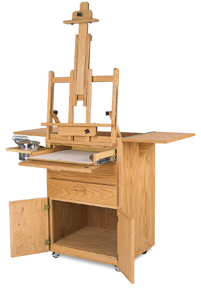
 A couple of weeks ago we stayed near Dick Blick's Art Supplies in New York City's Noho area. Best vacation in a while. Today, I was cruising Blick's site, thinking about the hand-ground oil paints I'd seen there (and lust after to this day), when I decided to look at easels.
 These ones really grabbed my attention. I will be building my own "his and her's"versions this summer. Look for photos by fall.
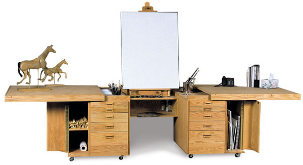 The second one is do-able.
(This is the one and only time I have used an image that isn't my own on this site.)
Thursday, June 07, 2007
The Opening
 Another painting from the show.
(Scarborough Pine trees with Berm)
Well... I can't claim the opening was any sort of a major social event. For all I know the only guests were Glen Downer, Lori Asaro and Vince Ng of Onland Navigation and Design, who graciously downed-tools and drove all the way downtown from Scarborough to see what Angela had got around to hanging. I hung around for a few moments after they left and then after a word or two with Angela, the curator I also left.
I was a little surprised by the relatively small space that ended up being 'appropriated' for the show, but, she hadn't been able to install the second bar for hanging pictures. Basically, I just took a bunch of paintings and the digital photo prints and told Angela to hang what she wanted and had room for. As it turned out the only painting hung was the double one on the Invite and the photos. AS the say, if you don't want to be disappointed, lower your expectations...My expectations were quite modest. Mostly, I'm pleased to have something new for my CV, and to keep moving forward.
Subscribe to:
Posts (Atom)